25 Above the Knee Tattoo Ideas That Look Effortlessly Cool

If you’ve been toying with the idea of some new ink, the space above your knee is a spot dreams are made of. It shows off just enough to make the whole thing feel fun (hi, shorts season!), but it’s easy and breezy enough to cover up when you’re going for low-key. And style-wise? Depending on your choice, above-the-knee tattoos can appear delicate and feminine, bold and graphic, or deeply personal.
Below, a roundup of above-the-knee tattoo designs that take into account the actual shape and movement of your leg—because yes, placement does matter. Some of these read like wearable jewelry, some are playful and cheeky, and others are the sort of meaningful pieces you’ll be glad you have in years to come. Take your time, bookmark your favorites, and give thought to how you want to feel when you see it in the mirror.
1. Barbed Chain Above-the-Knee Tattoo

There’s something unapologetically strong about a barbed chain wrapped just above the knee. It feels bold, grounded, and quietly defiant—like a boundary you’ve drawn for yourself and have no intention of explaining. This design gives off a confident, almost protective energy, balancing toughness with intention. It’s the kind of tattoo that doesn’t shout, but it absolutely holds its ground.
From a practical standpoint, this is one of those placement ideas that works beautifully for both women and men. The horizontal flow complements the natural curve of the leg, especially on athletic or fuller thighs. It’s a solid option for cover-up ideas too, since the bold lines and structure disguise older ink well. Styling-wise, it shines when paired with shorts or skirts that hit mid-thigh, letting the design peek out just enough to feel intentional.
2. Gothic Quote Above the Knee

A quote placed above the knee here always feels personal, but gothic-style lettering ups the ante. It has gravitas, the way a mantra you live by might—not some decoration. There’s an emotional register here that translates particularly well to those who find meaning more meaningful than trends—words that sound earned, rather than seized upon out of thin air.
The style is perfect for guys with tattoos of some significance, but it’s also great for a woman who wants to have large and in-charge typography over feminine script. The blocky lettering ages better than its finer counterparts. If you are thinking about a quote, stencil, or ideas with words, this is an ideal way to go: clean lines, high readability, and very little in the way of carnage after it heals.
3. Minimal Mountain Linework Tattoo

There’s a calm, almost meditative feeling to a simple mountain outline above the knee. It feels like freedom, solitude, and quiet strength all rolled into one understated design. This tattoo doesn’t demand attention—it invites a second look. Perfect for someone who finds beauty in stillness and wide-open spaces.
This is a great example of simple women’s tattoo ideas that also translate effortlessly for men. The fine linework suits all skin tones and works especially well if you prefer low-commitment designs. It’s also ideal if you’re testing the waters with above-the-knee placement ideas, since it’s easy to expand later or keep just as it is.
4. Moth and Crescent Moon Tattoo

This moth and crescent moon design feels mysterious, feminine, and a little magical. That’s because it has that quiet-night energy—transformative, intuitive, and deeply personal. There is softness here, but also strength, particularly in how the wings confidently span the thigh.
When it comes to trends, this style remains huge for women going into 2026, especially among females with a penchant for symbolic tattoos such as butterfly and moth pieces of ink. The positioning above the knee enables details on wings without a distorted look. It’s happiest on medium to big thighs that it can breathe in, and it looks wonderful with frothy dresses or mannish boots.
5. Ornamental Lotus Mandala Tattoo

A lotus mandala on the thigh emits an instantly centered, grounded vibe. It feels deliberate and soothing, an ode to remaining balanced even when life grows loud. There are grace notes in the symmetry and a quiet confidence that never seems gaudy.
This is a great design for feminine flower tattoos and also for the top of thighs. I like the pattern, and it supports/holds up longer than other options. If you are attracted to women’s special designs that feel spiritual without being too literal, this is a forever piece.
6. Sun and Moon Face Tattoo

This sun-and-moon combination feels intimate and expressive, almost like two sides of the same soul sharing space. It’s playful, emotional, and slightly nostalgic—perfect if you love tattoos that tell a story without words. There’s a softness to the faces that makes it feel warm and personal.
Emotionally, this tattoo tends to resonate with women who’ve embraced change and balance over time. It’s also a lovely alternative to women quotes if you prefer imagery over text. The above-the-knee placement keeps it visible yet personal, making it easy to show or hide depending on your mood.
7. Matching Barbed Chain Tattoos

There’s something powerful about matching tattoos like this—especially when they’re bold but not sentimental. These mirrored barbed chains feel strong, intentional, and unified without being overly emotional. It’s more about shared mindset than shared history.
This style works well for couples, siblings, or even close friends. From a practical angle, traditional-inspired linework like this is durable and ages well. It’s also versatile for men and women alike, fitting seamlessly into traditional American aesthetics while still feeling modern.
8. Floral Mandala Above-the-Knee Tattoo

This big, bold floral mandala feels kind of sassy and crisp—like you’re wearing a piece of art instead of ink. It has movement, depth, and a visual intensity that elevates the leg right away. There’s nothing demure about this piece—it is there to be seen and admired.
This is the perfect one for you if you like floral and want to go a little bold. There’s plenty of room for detail in the above-the-knee space, without anything crisscrossing weirdly. It looks great with simple ensembles, allowing the tattoo to do all the talking.
9. Bold Year Number Tattoo

A single year inked above the knee can say more than a full sentence. It’s direct, meaningful, and unapologetically personal. Whether it marks a birth year, a turning point, or a loss, this kind of tattoo carries quiet emotional weight.
This is a popular choice for men who want meaningful alternatives and also works well for women who want simplicity with depth. The bold font keeps it readable over time, and the placement ensures it remains a personal reminder rather than a public announcement.
10. Sacred Heart Pair Tattoo

These sacred heart tattoos are raw, emotional, and beautifully symbolic. It’s painful and loving and resilient all at once, a single image that can’t be ignored. It has that classic tattoo shop vibe with a piercingly personal edge.
Print of “My Redeemer Lives My Homegirls” This style takes both traditional and American traditional influence, thus making it a good choice for both men and women Christian tattoo enthusiasts. The symmetry plays very pleasingly above the knee, and these aggressive lines will span. If you’re attracted to the Christian women’s and Christian men’s imagery with abundant emotion, this is a strong method for showing off your story.
11. Butterfly + Botanical Linework Statement

This one feels almost like a little personal “reset button”—a butterfly is hovering above parallel clean lines and leafy branches that frame the knee in the sweetest way. It’s soft without being very loud, like whispery assurance, and you don’t have to explain yourself. The symmetry is what gives it that finished, intentional look; the botanical-ness of it is what keeps it soft and feminine.
And if you’re a fan of women’s placement ideas that elongate the leg, this works particularly well for those hoping to achieve a long vertical figure (hi there, leg-lengthening wizardry). It’s an excellent choice for medium-to-larger designs because the lines really want some room to breathe. Request your artist to map it while you’re up so the center line remains level with movement, and keep the details sharp by consistently moisturizing and applying sunscreen once healed.
12. Ornamental Patchwork Flower Crest

This is the sort of tattoo that seems like it’d come with a story—like, I found this vintage keepsake in a jewelry box and now can’t stop obsessing over it. The lush ornamentals, small red flower, and framed shapes lend it a confident, curated feel. It looks traditional in spirit, with a modern, graphic edge, upon which we do not feel that we are witnessing it back again.
For aftercare and long-term glow, treat this second-skin moment like the investment piece it is: Polish only occasionally, wash the edges to discourage tight denim (but not until it’s healed!), and consider spreading on a whisper-soft fragrance-free layer of ointment (not a greasy one). Sunscreen, once healed, is nonnegotiable so that the color remains vivid. If you want it a bit more sharp, request clean line weights and solid pack in the volumes with darker colors—those are the features that make this style look like an expensive one.
13. Bold Floral Bouquet With Butterfly Accents

This one translates as I’m sweet, but I’m not fragile. The big bloom’s here, the confident little spotlight, and the leaves flop around lustily, almost purposefully. That, along with the minuscule butterfly details (those wings aren’t much longer than an eyelash), and suddenly it’s not just pretty—it feels like a whole mood: grounded, burgeoning, maybe even a little bit fearless. Total Women Flowers moment.
The thing that makes this design feel instantly classic is the stark contrast—heavy lines combined with gentle shading give it an outsize dose of longevity, even long after you’ve had it done. Continue reading the main story: “It’s also forgiving on skin texture because the shapes are strong and readable. If you want it to mature nicely, leave the black areas solid and stay away from super-tiny micro-details in the petals. And this design holds up well and still looks crisp as the tattoo “settles.”
14. Matching Minimal Star Chain Above the Knees

Okay, this is what cool-girl subtle looks like. The little flecks of star-like shapes feel fun, a little bit punk, and just in the right spot—as if you’re in on a secret style. It’s minimalist, but it still stands out because the placement is so unexpected. If you’re a fan of matching tattoos that seem completely calculated but not at all shouty, this is such a chic move.
This falls right in line with what’s happening now (and particularly will happen in 2026)—the small, simple graphic tattoos that read very fashion-forward and are easy to live with. Because the lines are fine, ensure that you trust the person wielding the needle. “Find yourself a good artist with a steady hand and ask for something simple; generally you can come up with a stencil that looks balanced when in both standing and seated positions,” he says. Make the pattern “micro,” not “herringbone-contact-paper small,” and it won’t get blurred over time; you’ll have a perfectly crisp, new look for years.
15. Quote with Butterfly and Flame Details

This one hits you in the feels—a quote that sounds like “WTF? Is this Bae promising to me?” and a butterfly that looks like it’s emerging before your very eyes. The flame details give that extra touch, like, “Yes, I’ve been through it… and I’m still here.” It’s intimate and meaningful without being sappy, and the words are something you’d actually want to live by.
The payoff is enormous, emotionally, with tattoos such as this: it’s a steadying reminder you carry on your own body, and that act can feel unexpectedly comforting on hard days. To get the best possible outcome, go with simple text that is clearly legible (thin fonts can blur), and choose just a slightly larger size so the words remain clean. If a lighter touch sounds more your speed, maybe a delicate cursive style—but only when legibility takes precedence.
16. Mandala Lotus Eye Above-the-Knee Statement

There is something powerful about this design in that calm, centered way—like you’ve done the inner work and you’re not apologizing for taking up space. Its lotus shape makes for a pretty, ladylike base, and the eye detail offers a touch of intrigue (in the best possible way). Hers is the kind of tattoo that looks intentional from across a room or through the gauze, not just “pretty up close.”
When it comes to outfits, this one is a fan of the clean hemline: short shift dresses, neatly cut shorts, or—why not? — a sleek skirt that lets the design dance around its edges like jewelry. Keep accessories simple—gold hoops or a bold lip—and let the tattoo do the talking. Because it’s symmetrical, ensure the artist positions it with care using your natural stance so that when you walk, it rests at an even level.
17. Dainty Minimal Floral Vine

This is for the one who wants something intimate and sweet, a little whisper instead of a full speech. The linework is airy and dainty, and it has a little floral moment that feels easy and romantic.” It’s not especially ambitious, and that’s really what makes it so charming. To be fair, it does run with “I’m naturally stylish” energy.
If all you want is a simple tattoo for women that’s easy to live with, this one’s a low-maintenance dream. It heals quickly since there is not heavy shading, and it goes from workwear to gym shorts to date-night dresses.” Just remember that ultra-fine lines might fade more quickly, so opt for an experienced artist and keep it out of the sun to preserve that soft look.
18. Butterfly and Quote Collage With Bold Extras

This leg moment is like the entire personality lineup—bold, playful, and a little bit rebellious. The flaming butterfly with the words up top has a “main character” vibe, and it’s buoyed by all of the additional flourishes around it—too much junk in any other tattoo, but just enough here to feel like you’re looking at an anthology instead of one tattoo. It’s bold and brazen, like you are creating your own visual diary.
A collage-style arrangement offers flexibility compared to one large piece: you can add on over time without the pressure of everything needing to match perfectly. The trick is spacing—give them breathing room for the tattoos to read. If you want it all to feel unified, pick one consistent thing (line weight, shading style, or a theme like “Quote + Butterfly”), and then it’ll look intentional rather than random.
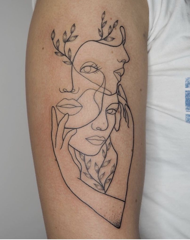
19. Minimal “Hands Reaching” Fine-Line Art

This is quiet but says so much. Two hands reaching toward each other reads romantic and spiritual and a little artistic—like you have a soft spot for meaning without requiring your whole thigh to explain it. It has “gallery girl” energy, and it’s the tattoo everyone notices second … and then can’t stop thinking about.
The vibe here is delicate and private, so position matters: above the knee is ideal because it reads as personal and just behind a veil until you sit down. Opt for a clean stencil and strip, a measured line so it doesn’t look shaky over time. Fine-line tattoos also adore consistent skincare—moisturize after they heal and wear sunscreen, particularly if you’re a shorts-all-summer kind of person.
20. American Traditional Flower Band

This is a tattoo that feels like it’s classic the moment the artist sets down their machine. The sharp petals, cartoon outline, and graphic shading give it that classic American swagger, but like the floral shape of a classic rose or tulip, it’s warm and wearable. It’s just the right balance of grit and grace, which, if we’re being honest, is kind of an entire personality.
If you’ve been on the fence, take this as your nudge: Traditional designs age well because they’re made to be legible in one glance. Maintain that flower size large enough to hold detail, and don’t shy away from saturation—the strong blacks and colors are what make it last. One day you’ll look down and see that your outfit is still so, well, you—just with added flair.
21. Mandala Knee Frame Duo

This one is wearable confidence—ornamental, but balanced, and a little bit regal. It’s the perfect “made for you” look in the way that only jewelry that stays on forever can be.” It’s got detail without fussiness, and that sort of zen, centered energy that says quietly, “You know who you are.” If you’re obsessed with women’s placement ideas that feel solid from every angle, this is so f*$king satisfying.
What makes it special is the framing: With one mandala on top and another below, you have symmetry that flatters the leg and allows movement to appear—rather prettily! Tell your artist to stencil it standing and sitting so the petals line up when you bend your knee. Because there’s a lot of linework, treat the healing softly—thin applications of ointment and no tight leggings; sunscreen later to keep details crisp.
22. Playful words are tattooed

This is the kind of tattoo that stops everyone and makes them giggle—a set of short, crisp words takes your leg into a bit of an inside joke. It’s weirdly confident-charming, like you don’t give a damn but somehow still care enough about style. The placement of the curves feels graphic and intentional and proves that sometimes plain text can also have the most personality.
If you’re looking for something low maintenance that still looks sharp, lettering like this is fabulously easy. And that you keep the font on the heavier side (it ages well) and select a crisply stenciled version that has nice, even spacing (small gaps can get blurry with time). Once you’re healed, it’s essentially “set it and forget it”—moisturize, wear sunscreen, and go. Plus: easy one to add around later if you decide you want to include more Words or small icons.
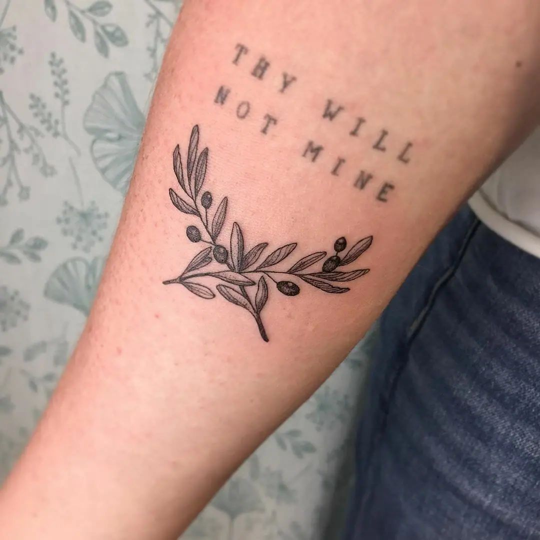
23. Meaningful Date With Laurel Wreath

This design has such strong “Milestone” energy—you can see that the date means something to someone and is just dressed up with this proud laurel butting in: not overly flashy. It’s the sort of piece that is meaningful to read without explanation, and the wreath gives it a classic or almost ceremonial take. If you like men’s ideas that still feel timeless and clean, this hits that sweet spot.
Who it’s for: Anyone who wants men’s words in lasting ink that isn’t tough to match with everything, and especially if you prefer an easygoing look over intricate imagery. The above-the-knee positioning is good for anyone who likes to be visible in shorts but wants easy coverage at work. Keep the size big enough that it won’t disappear into a smudge in future years, and request an even line weight so the wreath won’t wear unevenly alongside the heavy lettering.
24. Matching Spiked Chain Bands

This is pure attitude—like you’re wearing an edgy accessory that no one can take away from you. The chain links feel bold and graphic, and the spikes add a little “don’t test me” energy in the best way. The fact that it’s matching across both legs makes it look styled on purpose, not random, like a fashion decision you committed to.
This style taps into current trends—strong, 3D-looking designs with clean shading that read instantly from a distance. For the best result, ask your artist to map the bands while you’re standing so the chain stays level, not tilted. Because it wraps the leg visually, keep the placement slightly above the knee’s widest bend to avoid distortion when you move. If you ever need cover-up ideas later, this kind of bold band also plays nicely as a base layer.
25. Flame Band With Tiny Quote

And this one’s kind of cheeky/cool—the flame edge feels spicy, and the tiny quote is like a wink. It’s giving “I’ve got a sense of humor, and I’m not afraid to show it,” which frankly is the most attractive combo. The juxtaposition of the bold flames with delicate words makes it work, like you built your punchline to complement the outfit.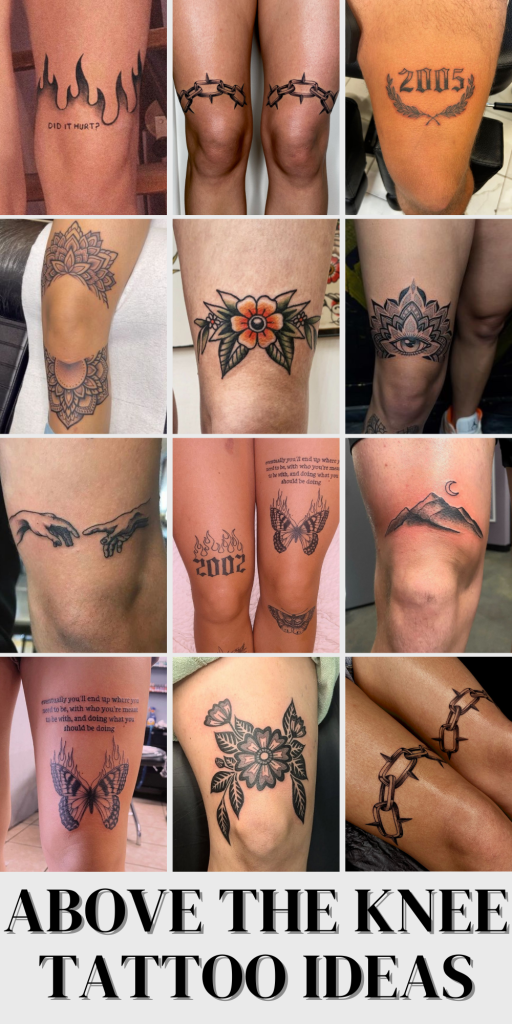
The vibe here is cocky and a bit rebellious, though your execution should be pretty clean: think strong (not too many strokes), solid black pigment in the flames, and text that isn’t so small it won’t age well. If you’re choosing between fonts, favor readability over fancy—the quote stencil looks best when it’s clean. This placement is ideal if you want something that pops above shorts but still feels personal when you’re all dressed up.
In the end, the ultimate tattoo will be one that fits you just right—whether that’s with a super-small minimalist sketch, a detailed statement piece that wraps around the circumference of your finger, or a classic traditional flower motif that pulls at your heartstrings. If you’re unsure, do the placement first (stand, sit, move a bit, and look at where it falls), then choose a design that aligns with both your lifestyle and level of concern about being visible.
And here’s my friendly reminder: don’t rush that artist choice, don’t go too tiny with text, and seriously, treat sunscreen like an investment piece for your long-term tattoo. Your above-the-knee must age like your best outfit (i.e., still sharp, still flattering, still making you feel fresh every time you put it on).