23 Tattoo Shading Ideas That Make Black and Grey Ink Look Like Art
There is something about great tattoo shading that instantly makes a design feel richer, moodier, and more personal. A simple outline can be lovely, sure, but once soft gradients, velvety dotwork, and deep black contrast come into play, the whole tattoo starts telling a bigger story. That is where the magic lives. Good shading adds emotion, texture, depth, and that polished finish that makes people stop and look twice.
This collection of tattoo shading ideas moves through a little bit of everything: soft florals, surreal concepts, graphic blackwork, delicate ornamental pieces, and designs that feel quietly meaningful without trying too hard. Some are minimal, some are dramatic, and some sit beautifully in that sweet spot right in the middle. If you have been saving inspiration and trying to figure out what kind of black and grey work feels most like you, these 23 ideas are a very good place to start.
1. Soft Floral Shading With Delicate Leaf Work
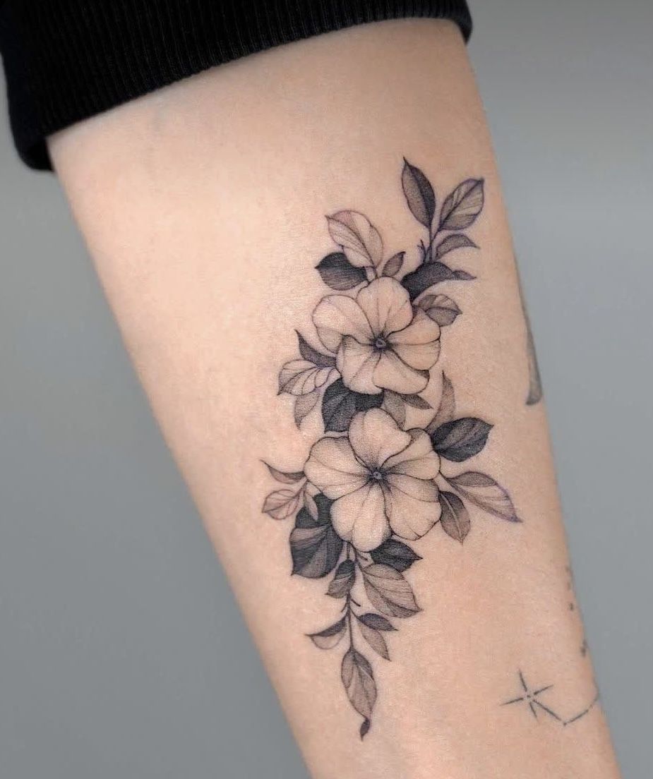
There’s something quietly beautiful about this Flower composition. It does not scream for attention, yet it absolutely holds it. The petals feel airy and clean, while the leaves bring in that deeper contrast that makes the whole piece look polished and grown-up. I love tattoo shading like this because it gives even a familiar floral idea a more refined personality. Instead of feeling overly sweet, it reads elegant, balanced, and a little romantic in that effortless way. The soft grey gradients inside the petals keep the design light on the skin, while the darker leaf shading anchors everything so it feels intentional rather than floaty. It is one of those designs that make you think, yes, this is pretty, but it also feels timeless.
This kind of simple floral piece works especially well for someone who wants classic styles without the heaviness of full black fill. The shading techniques here are flattering on the forearm because they elongate the shape and help the tattoo move naturally with the body. If you’re saving filler ideas for a larger botanical sleeve later, this is also a smart direction because the leaves and negative space leave room for a future Background. Ask your artist for a soft stencil placement that keeps the cluster vertical, and make sure they use smooth gradient work rather than overly dense packing. It is a lovely option for first-timers too, because it feels feminine, wearable, and never overdone.
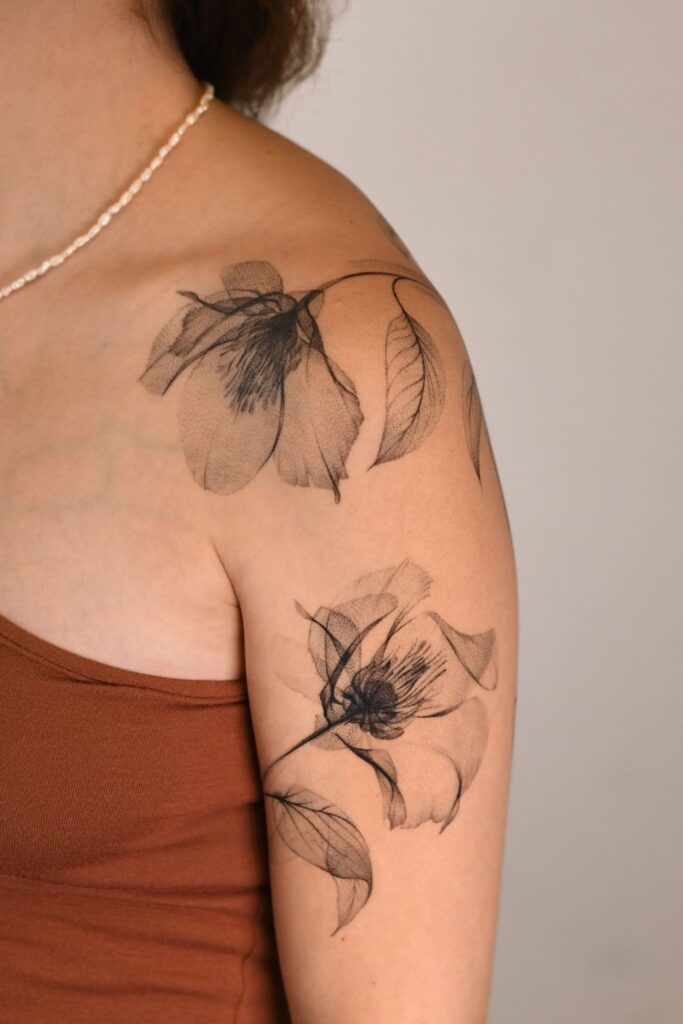
2. Magnolia-Inspired Bloom With Stippled Depth
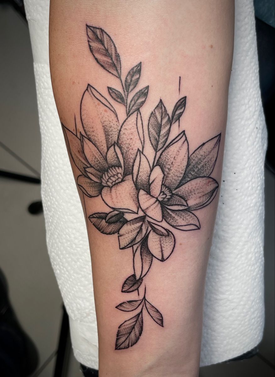
This one has a slightly moodier edge, and that is exactly why it is so appealing. The flowers open in a way that feels almost architectural, with crisp outer lines and soft dot shading tucked into the petals. It has that modern tattoo shading look people keep saving to their boards because it feels artistic without losing its softness. The leaves stretch upward and outward, giving the whole piece movement, while the stippled texture makes the blooms feel dimensional instead of flat. There is no fuss here, no extra decoration trying to steal the spotlight. Just strong composition, clean designs, and a really confident use of negative space. It feels like the kind of tattoo you get when you want something pretty but still a little sharp around the edges.
What makes this piece special is the way the techniques do all the heavy lifting. Instead of relying on thick filler, the artist uses dot shading to build depth gradually, which keeps the Flower work airy and sophisticated. This is a great reference if you collect practice stencils or keep a practice sheet of floral ideas before committing, because it shows how controlled contrast can completely change the mood of a design. It suits calves, forearms, and outer arms beautifully, especially if you want a tattoo that reads clearly from a distance but still rewards a closer look. Tell your artist you love that textured, stippled finish so the petals stay soft instead of turning muddy over time.
3. Abstract Flow Shading With Smoke-Like Movement
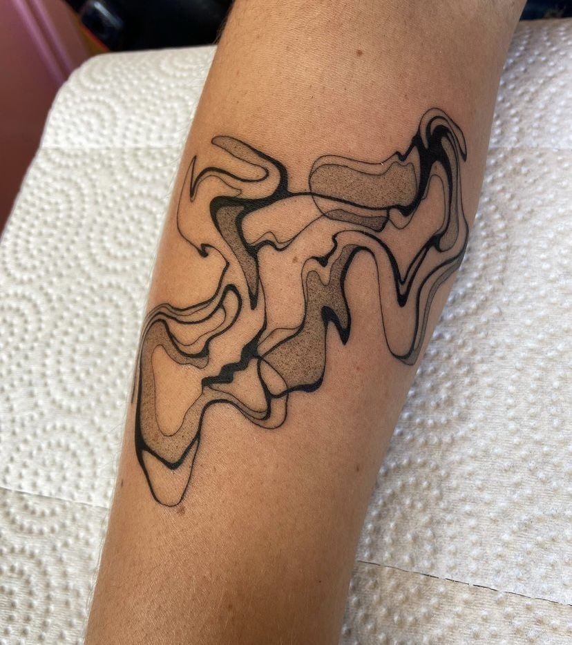
If floral work feels too expected, this abstract piece is such a fresh detour. It moves like ink drifting through water or smoke folding through air, and that alone gives it a cool, modern energy. I really like tattoo shading when it becomes the main character instead of just supporting the outline, and that is exactly what is happening here. The lines bend and ripple, then soften into grey clouds of tone that feel fluid and a little hypnotic. It has a gallery-wall kind of confidence to it, the kind of tattoo that makes people look twice because they cannot place it immediately. That mystery is part of the charm. It feels expressive, stylish, and just rebellious enough without slipping into anything too loud.
This is a strong choice for someone who wants ideas outside traditional designs and likes cleaner, art-driven styles. Compared with botanical work, abstract shading like this leaves more room to play with placement and scale, so it can wrap beautifully around the forearm or calf. It is also a wonderful reference for practice if you are studying gradient techniques from a Practice worksheet, because you can really see how contrast, line weight, and open Background create motion. Keep the palette black and grey for the strongest effect, and ask for smooth transitions rather than harsh blocks. The beauty of this tattoo is that it feels personal without needing an obvious symbol.
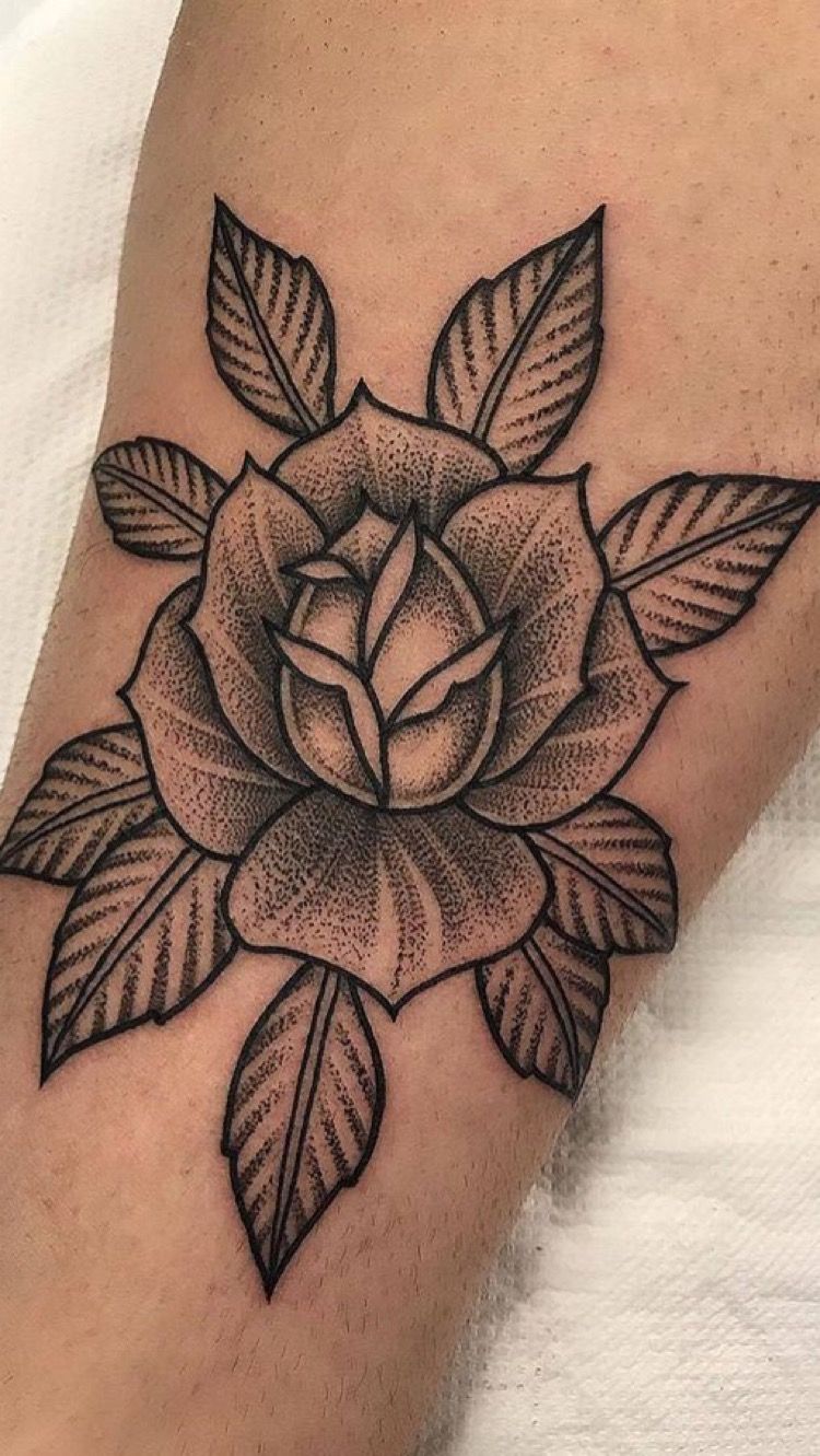
4. Engraved Rose Shading With Traditional Character
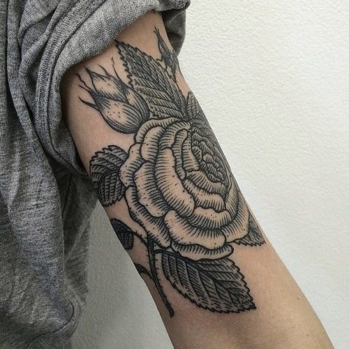
This Rose has a wonderfully old-soul presence. The line work is bolder, the texture is more deliberate, and the shading feels almost engraved, like something lifted from a vintage illustration. It is the kind of tattoo that carries weight without needing a lot of size. Every leaf, every petal, every dark pocket of shadow adds to that rich, grounded feeling. There is a little toughness to it, too, which I love. It does not feel sugary or fragile. It feels steady, confident, and beautifully rooted in Traditional tattoo language while still looking wearable in a modern way. If you like your ink to have personality and history, this is exactly the sort of piece that stays interesting year after year.
The vibe here is perfect for anyone drawn to Traditional styles but wanting a softer black-and-grey finish instead of bold color packing. Because the shading is denser, this design holds especially well on areas like the upper arm, calf, or thigh where the Rose has room to breathe. It also ages nicely when done with clean structure, since the petal separation is strong from the start. If you are comparing floral designs, this one feels more grounded and graphic than whispery fine-line pieces. Ask your artist for a sturdy stencil and balanced darks so the tattoo keeps that carved, classic look. It is dramatic, but in a very wearable grown-up way.
5. Geometric Dotwork Shading With Minimal Leaf Detail
This tattoo is proof that minimal does not have to mean boring. The geometric forms feel crisp and intentional, but the dot shading softens them just enough to keep the whole piece from feeling cold. I love the tiny leaf detail at the top because it turns what could have been purely abstract into something a little more organic and human. The result is clean, stylish, and quietly clever. It almost reads like modern wall art translated onto skin, which makes it feel very current without chasing trends too hard. There is restraint here, and honestly, that is its strength. The design breathes, the shading does not crowd the eye, and the whole thing feels calm in the best possible way.
This kind of work is having a real moment because people want tattoo shading that looks intentional, simple, and elevated. The dot-based techniques create a velvety finish that works beautifully for geometric filler ideas or as a standalone statement. If you keep a practice sheet of modern designs or collect practice stencils before your appointment, this is a smart one to save because it shows how a little Background texture can create depth without clutter. It is ideal for arms and calves, especially if you prefer tattoos that pair easily with other styles later. The key is precision, so choose an artist whose line work and stippling are equally strong.
6. Bold Lotus Flower With Graphic Filler Shading
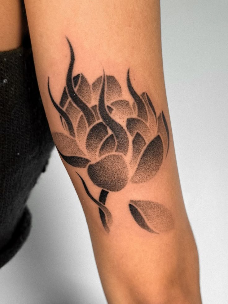
This Lotus flower has a bolder personality, and honestly, it is gorgeous for that reason alone. The petal shapes are simplified, almost poster-like, but the tattoo shading gives them richness and softness where you need it. Then those dark, flame-like accents cut through the form and give the whole piece a dramatic push. It feels spiritual, graphic, and a little fierce all at once. That balance is not easy to pull off. Some lotus tattoos can lean too delicate or too decorative, but this one has real presence. It feels like a tattoo for someone who wants symbolism, yes, but also wants the artwork itself to feel confident and memorable on the skin.
If you are after an emotional payoff, this kind of piece delivers. The bold filler and smooth gradient techniques make the design feel powerful without turning heavy, which is why it works so well on the forearm. It is a strong choice if you love symbolic Flower tattoos but want something less predictable than a soft botanical stencil. Compared with finer lotus designs, this version reads more clearly from a distance and has a stronger edge in photos and everyday wear. Ask for clean spacing between the petal sections so the shading stays distinct. It is the sort of tattoo that can make you feel instantly more put together, even in a plain white tee.
7. Birth Year Floral Piece With Fine-Line Background
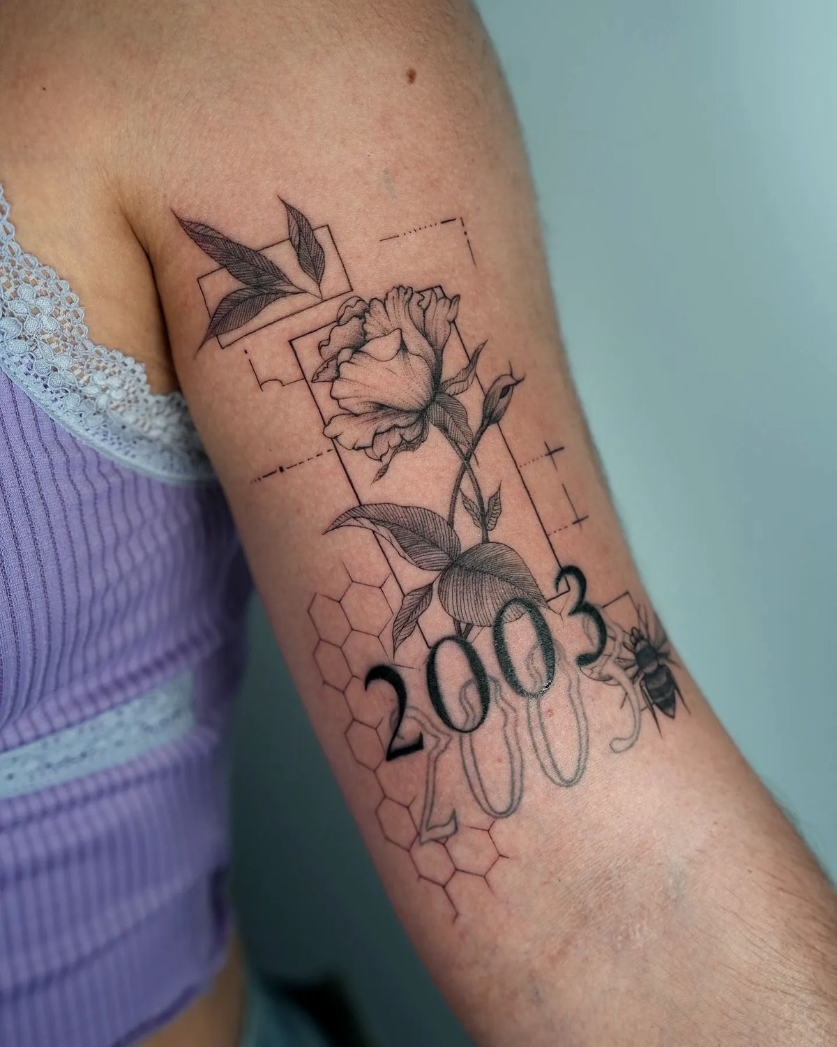
This design has such a personal, curated feel to it. The Flower, the year, the bee, the geometric framing, the honeycomb detail—all of it comes together like a tiny story rather than a random collection of symbols. What keeps it elegant is the tattoo shading. Without those soft shadows in the petals and leaves, the piece could feel busy, but the grey work gives it cohesion and a gentle rhythm. It reads sentimental without being overly obvious and artistic without trying too hard. I especially love how the numbers are softened by the floral line work around them. It feels thoughtful, modern, and deeply wearable, like a memory dressed up in a very stylish outfit.
This is the kind of tattoo to wear with confidence because it already feels like an accessory. Fine-line Background elements like these pair beautifully with everyday jewelry, soft lipstick, and sleeveless tops because the piece has enough detail to feel special without overwhelming your arm. If you are collecting ideas for commemorative designs, this is a lovely example of how to combine a Flower motif with meaningful numbers and a secondary symbol without creating visual chaos. Ask your artist to keep the stencil airy and the shading delicate around the extra elements. That balance is what makes the tattoo feel refined instead of crowded, and it is exactly why this style photographs so well.
8. Dreamcatcher Shading With Soft Feather Movement
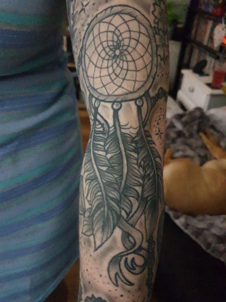
This dreamcatcher piece has a more lived-in, expressive feel, and that gives it real character. The circular web at the top brings structure, while the feathers below soften everything and add that swaying sense of movement. The tattoo shading here is not trying to be ultra-clean or cosmetic. It feels more atmospheric, which works beautifully for a design that is already symbolic and a little dreamy. I like that the feathers are shaded enough to feel dimensional without becoming heavy, and the dotted accents around the piece help it settle into the skin naturally. There is something comforting about it. It feels personal, a little mystical, and very grounded in emotion rather than trend.
Compared with sharper, more graphic designs, this one gives off a gentler attitude. It is a strong option for someone who loves meaningful tattoos and wants softer styles that still have enough detail to feel rich. The feathers are where the shading really matters, so an artist with smooth grey techniques and steady Needles will make all the difference. This can also inspire practice stencils if you are exploring symbolic work, because it shows how Background dots and feather texture can add depth without overcomplicating the outline. Keep the placement long and vertical so the movement stays graceful. It is expressive, but still easy to live with every day.
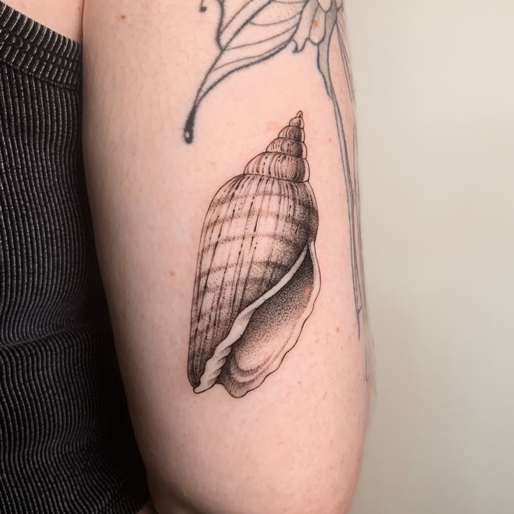
9. Seashell Dot Shading With Quiet Coastal Detail

This little shell tattoo is understated in the loveliest way. It does not rely on size, extra symbols, or dramatic contrast to make an impact. Instead, it uses careful tattoo shading to build shape and tenderness, almost like the shell was lightly sketched and then breathed into. The stippling inside the form gives it texture without making it feel busy, and the soft shadow beneath the opening creates that subtle sense of depth that makes the whole piece feel finished. It is beachy, yes, but not in an obvious vacation-souvenir way. It feels collected, personal, and calm. The kind of tattoo you get because it means something to you and then discover it also happens to look incredibly chic.
If you have been wanting to try something now but do not want a big commitment, this is such a smart place to start. Small, simple tattoos like this work beautifully on the arm, ankle, or rib area, and the clean dot shading keeps the design elegant instead of flat. It is also a great reminder that Background does not always need to be elaborate; sometimes a soft tonal fade is enough. Save it if you are building a folder of subtle designs or lightweight filler ideas for a future ocean-themed collection. The best version of this tattoo comes from restraint, so ask your artist to keep the texture fine and the silhouette crisp.
10. Classic Rose Shading With Crisp Dotwork Texture
A Rose like this never really goes out of style, and this one proves exactly why. The petals are bold and sculptural, but the dot shading softens the structure just enough to make the flower feel rich instead of rigid. I love the balance here between classic and modern. The overall silhouette is timeless, almost Traditional in spirit, yet the texture gives it a fresher finish that feels very now. The leaves framing the bloom help it sit beautifully on the skin, and the use of shadow inside the center petals draws your eye straight in. It is romantic without being sugary, polished without feeling precious, and strong in a way that works on almost anyone.
This is a low-fuss tattoo choice in the best sense. Because the design is clear and the shading techniques are so consistent, it tends to age gracefully and stay readable over time. It suits people who want dependable, classic Flower designs with enough personality to stand on their own, whether as a solo piece or part of a larger sleeve. If you are comparing Types of floral shading, this one sits right in that sweet spot between solid blackwork and whispery fine line. A clean stencil, thoughtful spacing, and an artist comfortable with dot gradients will keep it looking sharp. It is one of those forever ideas that still feels stylish the minute you get it.
11. Bell Jar Ear Tattoo With Soft Museum-Style Shading
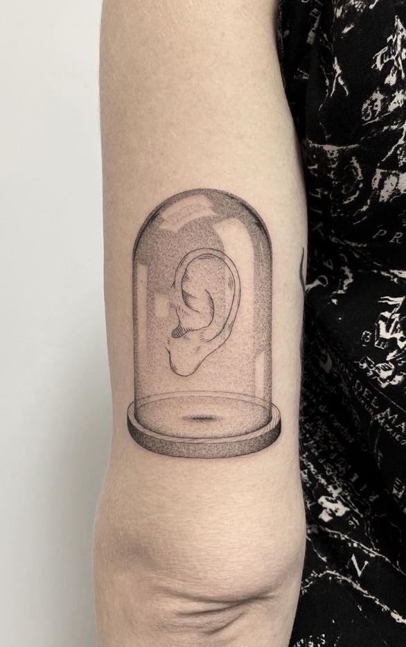
This piece is strange in the best possible way. A single ear suspended under a glass dome sounds a little surreal on paper, but the tattoo shading makes it feel oddly elegant instead of gimmicky. The soft gradients inside the bell jar create that fragile, preserved quality, almost like a tiny specimen from a beautifully curated cabinet of curiosities. I love tattoos like this because they feel intellectual and slightly eerie without needing a lot of noise. It is simple, yes, but not plain. The dome, the subtle shadow at the base, and the careful rendering of the ear all work together to create a quiet kind of drama that pulls you in the longer you look at it.
What makes this one special is how much the techniques do with so little. There is almost no extra filler, no loud Background, no distracting ornament, yet the illusion still feels complete because the shading is so controlled. This is a smart choice for someone who collects unusual ideas and wants a tattoo that feels more like visual art than a standard symbol. The forearm placement helps the shape read clearly, and it is especially effective when your artist keeps the stencil crisp and the gradients feather-light. If you love offbeat styles that still feel polished, this is exactly the kind of piece that stays interesting for years.
12. Whisper-Soft Mandala Flower Shading
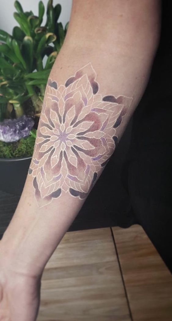
This tattoo has such a dreamy, almost powdered finish that it barely feels like ink at first glance. The floral geometry opens across the arm like a soft exhale, with pale layered petals and just enough depth in the outer forms to keep everything from disappearing into the skin. It feels gentle, graceful, and a little romantic without turning sugary. I really like tattoo shading that whispers instead of shouts, and this one absolutely does that. The whole design has a calm, meditative energy, like something between a Flower and a mandala, with those faint tonal shifts doing all the emotional work. It feels personal, feminine, and incredibly light on the body.
This kind of piece is perfect for someone who wants softer styles and does not love heavy blackwork. It flatters areas like the forearm or outer arm where a larger stencil can breathe, and it is especially lovely for people who prefer subtle tattoos that reveal themselves slowly. Because the shading is so delicate, choosing an artist with clean white-ink and soft-grey techniques really matters here. It is also a beautiful reference if you save ideas from a practice sheet or collect practice stencils before committing, because it shows how a design can feel airy and still read as complete. Quiet tattoos can be just as memorable as bold ones, and this one proves it.
13. Eagle Shoulder Piece With Layered Realism
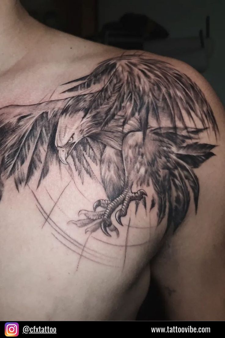
This eagle has that full, cinematic sweep that makes a shoulder tattoo feel instantly powerful. The wings stretch with so much motion that the whole piece seems to land and lift at the same time, and the tattoo shading is what gives it that muscle. The feathers are not just outlined; they are built in layers, with smoky darks tucked under lighter strands so the bird feels alive and commanding. There is a lot of intensity here, but it never slips into chaos. It feels sharp, proud, and beautifully controlled. If you like tattoos that carry some real presence on the body, this is the sort of design that changes the entire mood of the shoulder the second it is finished.
Realistic animal work like this has stayed popular because it blends classic designs with newer shading techniques in a way that still feels fresh in 2026. The key is choosing an artist who understands feather texture, directional flow, and how to build a subtle Background without muddying the bird itself. Shoulder placement is ideal because it gives the wings room to spread naturally with the body, which makes the composition far more striking than a cramped forearm version. If you are drawn to bold styles with meaning and movement, this is one of those pieces that always feels confident, never temporary, and absolutely worth the commitment.
14. Black Void Burst With Cracked Edge Shading
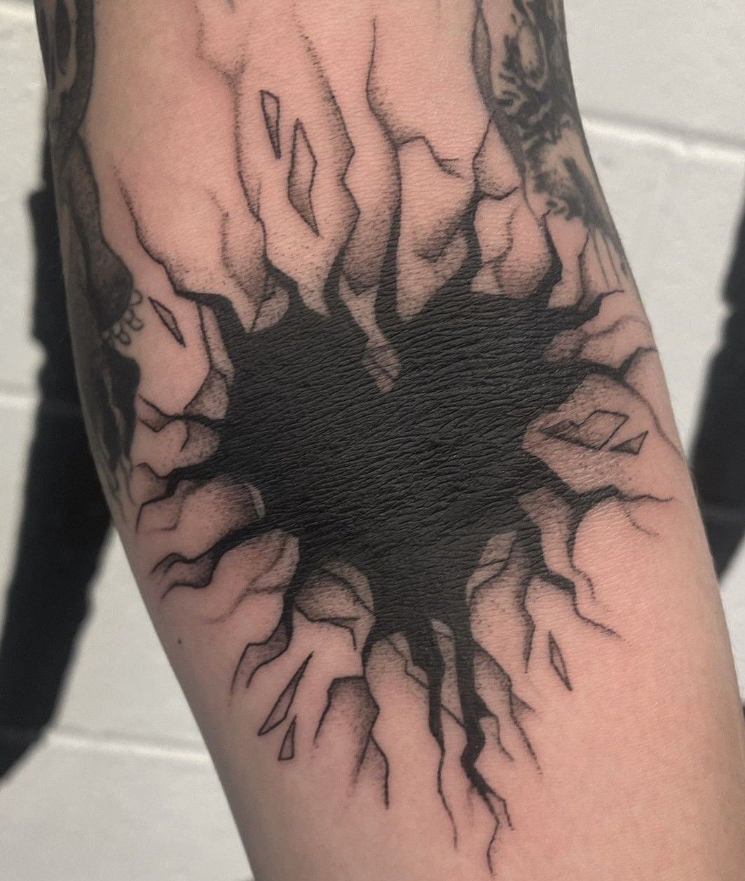
This one hits fast. It looks like a hole ripped straight through the skin, with jagged edges, smoky shadows, and that rich black center swallowing all the attention. What I like here is the balance between aggression and control. The tattoo shading around the broken edges keeps the illusion believable, while the solid fill in the middle gives the design that punchy, graphic center. It feels intense, yes, but also very clean. There is no extra storytelling or decoration trying to soften it. Just impact. That kind of restraint actually makes it stronger. It is dramatic in a very modern way, almost like body art translated from a graphic novel panel.
Compared with more detailed designs, this is surprisingly easy to live with because the idea is so clear from every angle. It can work as a standalone statement, but it also makes fantastic filler ideas for someone building a darker sleeve and needing strong Background energy between larger pieces. The design depends on contrast, so your artist needs to keep the stencil sharp and the edge shading smooth rather than fuzzy. If you want something bold but not overly complicated, this is a smart option. It gives maximum attitude with minimal visual clutter, which honestly is not easy to pull off well.
15. Broken Heart Tattoo With Watching Eyes
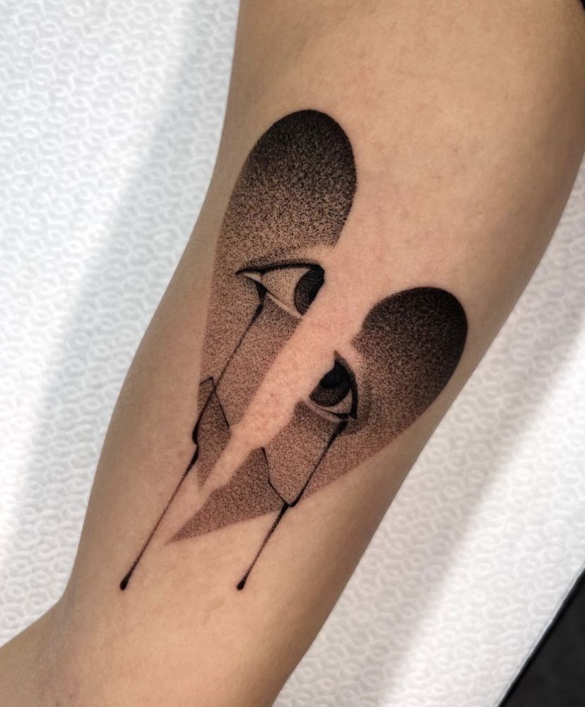
This Heart design is clever, moody, and just the right amount of dramatic. At first you see the broken shape, then the eyes settle in, and suddenly the whole tattoo feels more emotional than literal. That is what makes it memorable. The dot shading gives the halves a velvety finish, while the sharp tear down the center creates real tension without needing extra symbols to explain the point. It feels wounded, watchful, and oddly self-possessed all at once. I love tattoos that take a familiar idea and twist it just enough to make it feel fresh, and this one absolutely does that. It is simple in structure, but emotionally it lands much deeper.
The payoff with a piece like this is confidence. It has feeling, but it does not read as overly sentimental or overly cute, which makes it a great choice for someone who wants expressive designs with edge. The clean forearm placement helps the shape stay readable, and the smooth stippling keeps the shading from feeling heavy on the skin. If you are collecting ideas that sit somewhere between graphic styles and surreal tattoo art, save this one. A careful artist using fine Needles for the dot gradients will keep the texture crisp and the eyes sharp. It is heartbreak with backbone, and honestly, that is a great look.
16. Storm Cloud Tattoo With Lightning and Rain
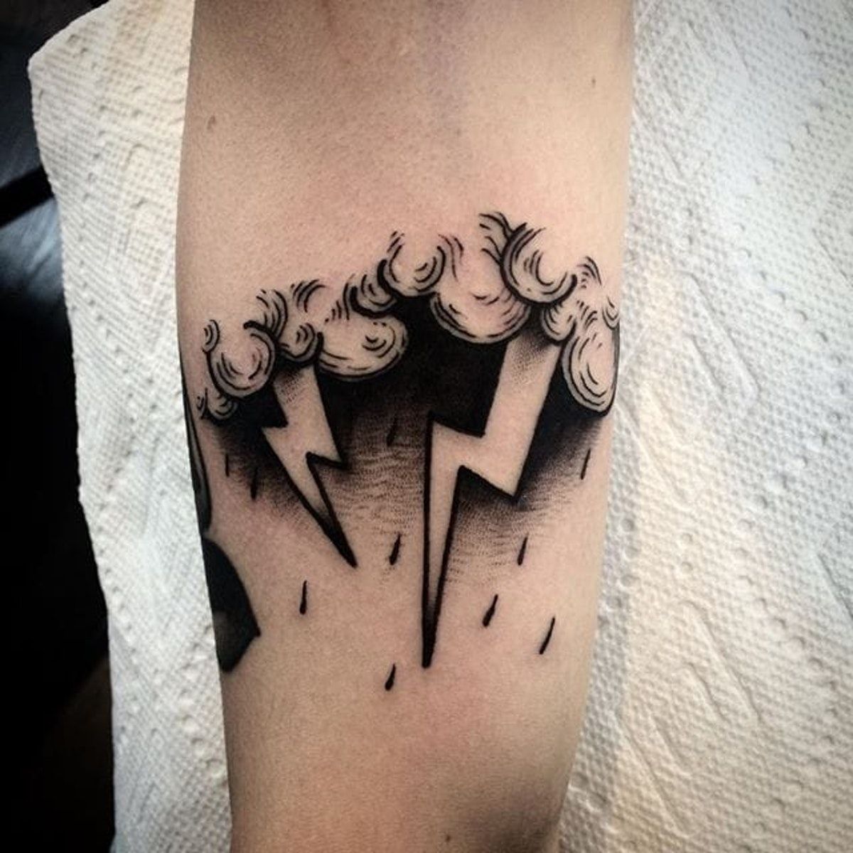
This storm piece has a bold, almost cartoon-dark charm that makes it impossible to ignore. The Cloud forms roll in like heavy curls of smoke, the lightning bolts cut straight through the composition, and the black shading underneath creates that satisfying sense of weight before rain. It is playful, but not childish. Moody, but still stylish. There is something about weather tattoos that always feels personal, and this one leans into that beautifully. You can read it as chaos, release, power, or just a cool graphic design. The simplicity of the shapes lets the tattoo shading take center stage, and that is exactly why it feels so strong.
The vibe here is bold and self-aware, perfect for someone who likes graphic styles with a little bite. It works especially well on the arm because the long vertical lines of the rain and lightning keep the composition moving instead of sitting too stiffly. If you are thinking about filler ideas for a sleeve later, a design like this can also bridge larger pieces beautifully because the Cloud and rain elements naturally extend into a Background. Ask your artist for solid blacks and soft, smoky drop-shadow work beneath the top line so the storm feels dimensional. It gives off a cool, stormy attitude without trying too hard.
17. Airy Floral Shoulder Shading With Sketch-Like Petals
This shoulder piece feels like a breath of air. The petals look almost brushed onto the skin, with those wispy edges and translucent layers creating a tattoo that feels light, artistic, and beautifully unforced. It is floral, yes, but not prim. The loose line work and smoky shading keep the Flower shapes expressive, almost like a charcoal drawing caught mid-motion. That is what makes it so modern. Instead of feeling tightly controlled, it feels intuitive and emotional, which gives the tattoo a softness that is incredibly flattering on the shoulder. There is a quiet sensuality to it too, especially with the way the blooms seem to drift rather than sit.
If you have been waiting for a sign to try softer botanical ideas, this is one. The shoulder is a gorgeous place for this kind of stencil because it lets the design follow the natural curve of the body, and the airy shading means the tattoo will not feel visually heavy with tank tops or dresses. It is especially good for someone who wants Flower tattoos but prefers painterly styles over crisp traditional outlines. Ask your artist to preserve plenty of open skin around the petals so the tattoo keeps that floating quality. Some designs shout. This one simply changes the whole mood of your shoulder in the prettiest possible way.
18. Drifting Ghost Tattoo With Soft Horror Dotwork
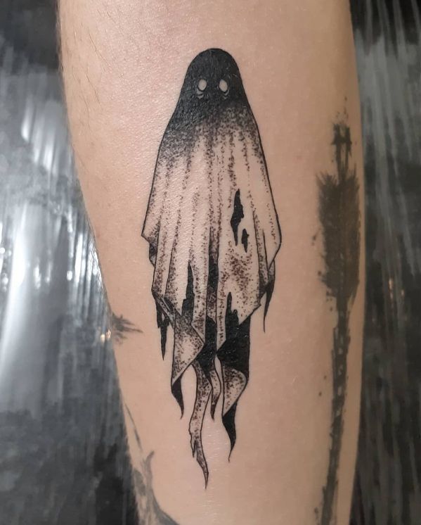
This little ghost is spooky, but in that stylish, slightly melancholy way that makes you want to look closer. The sheet-like shape is familiar, almost playful, but the torn edges, dark hollows, and speckled tattoo shading give it a much moodier personality. It feels lonely, cinematic, and a tiny bit creepy without tipping into full horror. I like that balance a lot. The black at the top fades down through the body so the whole figure seems to dissolve as it hangs there, which gives the design movement even though it is standing still. It is one of those tattoos that feels simple at first and then strangely emotional the longer you sit with it.
A piece like this is refreshingly low-fuss. It is easy to place, easy to read, and works beautifully as a standalone design or tucked between other darker tattoos as soft filler. The dot shading is the real hero, so an artist with smooth stipple techniques will make all the difference here. If you like ghostly ideas but do not want anything overworked, this is a smart direction because the shape is clean and the mood does not depend on a crowded Background. It wears well on the forearm, calf, or upper arm, and it has that rare mix of cute, eerie, and effortlessly cool.
19. Surreal Eyeball and Teeth Composition With Heavy Blackwork
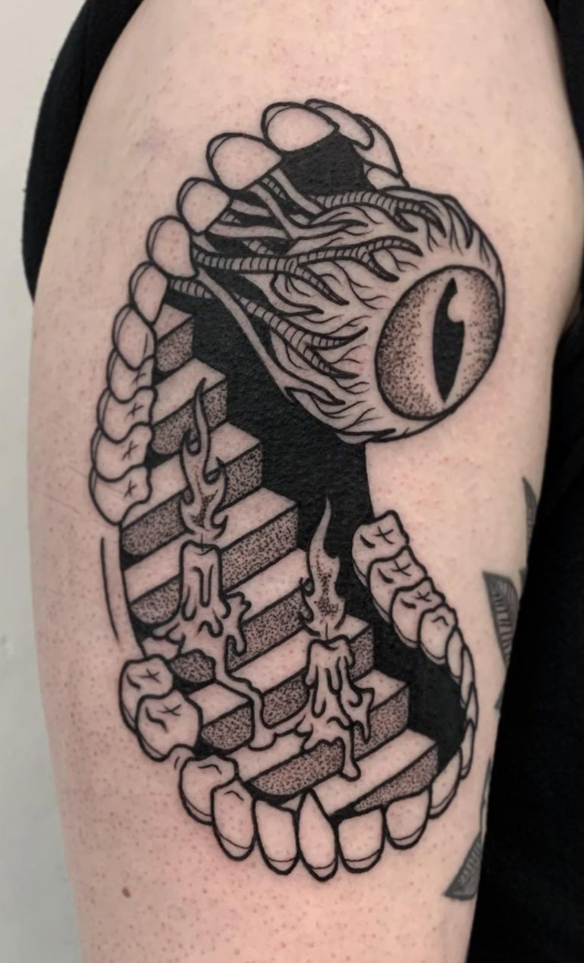
This tattoo is a whole nightmare in the most artful sense. The giant eye, the staircase, the candle drips, and the teeth framing the form—every part of it feels unsettling, but beautifully so. The heavy black fill in the middle creates a deep void that makes the eye look even more intense, while the stippled shading around the steps and flames adds texture without cluttering the composition. It is surreal, dark, and oddly elegant. Tattoos like this do not just decorate the skin; they create a full atmosphere. That is why this piece sticks in your head. It feels symbolic even if you do not explain it, and honestly that mystery is part of what makes it so good.
Surreal blackwork like this is having a real moment because people want designs that feel personal, symbolic, and a little unsettling without being messy. It is a strong option for someone who loves darker styles and wants a tattoo that reads almost like a private dream or a visual poem. Placement on the upper arm works especially well because the piece has enough height for the stars and eyes to breathe. If you are saving more advanced ideas or keeping a practice sheet of dramatic compositions, this is the kind of work worth studying. The contrast, the silhouette, and the layered shading all make it unforgettable.
20. Sunflower Half-Band With Rich Shadowed Petals
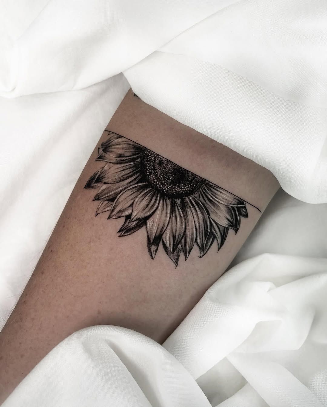
This sunflower feels moodier than the usual bright, cheerful versions, and that is exactly its charm. The petals are long and slightly dramatic, with darkened tips and velvety interior shading that make the whole Flower look lush instead of sweet. The cropped, band-like composition is also such a smart twist. Rather than centering the bloom in a predictable way, it lets the tattoo feel more editorial, almost like a floral shadow falling across the skin. There is warmth here, but also depth, and that mix makes it feel much more grown-up. It is soft, stylish, and quietly bold all at the same time, which is not easy for floral work to achieve.
Compared with lighter botanical designs, this one has more structure and more contrast, so it is ideal for someone who wants floral tattoo shading with a stronger visual payoff. The dark center and layered petals suit the leg beautifully because the shape wraps naturally and still reads clearly from a distance. If you love Sun-inspired motifs but want something more refined than a bright, literal interpretation, this is a gorgeous direction. Ask your artist to keep the petal edges crisp and the interior gradients smooth so the design stays dimensional over time. It feels feminine but never delicate in a forgettable way.
21. Eye in the Sun With Smoky Dot Shading
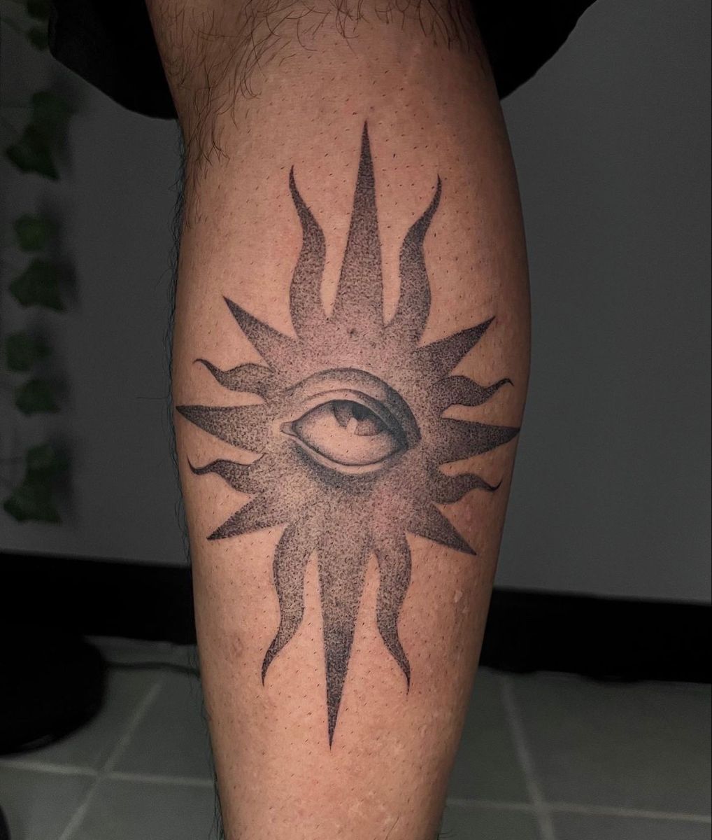
This Sun tattoo has that beautiful in-between mood where something mystical still feels clean and wearable. The eye at the center gives it a watchful, intuitive energy, while the pointed rays keep the whole design sharp and graphic instead of overly dreamy. What really makes it sing is the tattoo shading. The soft stippled fade around the eye and through the rays creates depth without turning the piece heavy, so it still feels open on the skin. It is bold, but not loud. Symbolic, but not cliché. There is something quietly magnetic about a design like this, like it carries its own little universe without needing extra decoration to explain itself.
This kind of piece works especially well for someone who wants simple symbolic ideas with more personality than a standard celestial stencil. In 2026, tattoos like this still feel current because the dot-based techniques keep classic motifs looking softer, more modern, and easier to wear every day. It fits calves, forearms, or upper arms beautifully, especially if you want a centered design that reads clearly from a distance. Ask your artist to keep the Background airy and the shading smooth so the eye remains the focus. It is a strong choice when you want something spiritual, stylish, and timeless all at once.
22. Cloud-Faced Portrait With Soft Realistic Shading
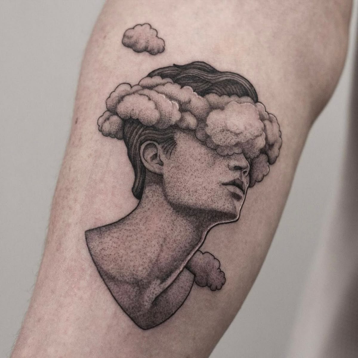
This portrait feels like a thought you cannot quite put into words, which is exactly why it is so compelling. The face is elegant and grounded, but the Cloud cover across the eyes shifts the whole mood into something more poetic and a little haunting. It suggests introspection, mystery, and that beautifully human feeling of having too much on your mind. The tattoo shading is doing gorgeous work here, especially in the neck, jawline, and cloud textures, where the soft tonal transitions keep the piece realistic without making it stiff. It feels emotional, fashion-forward, and a little cinematic, like a quiet scene from an art film you keep thinking about later.
If you have been craving a tattoo that feels more personal than decorative, this is such a strong direction to try now. Portrait-based designs like this suit people who love expressive styles and want their ink to say something without spelling it out. The forearm or calf placement gives the bust enough length to breathe, and the soft grey techniques help the design stay sophisticated rather than overly dramatic. Choose an artist with a light hand and real control over smooth realism, because that is what keeps the face, the Cloud, and the open Background feeling seamless. It is the kind of tattoo that does not just sit on the skin; it changes the atmosphere around it.
23. Ornamental Sleeve Shading With Floral Mandala Flow
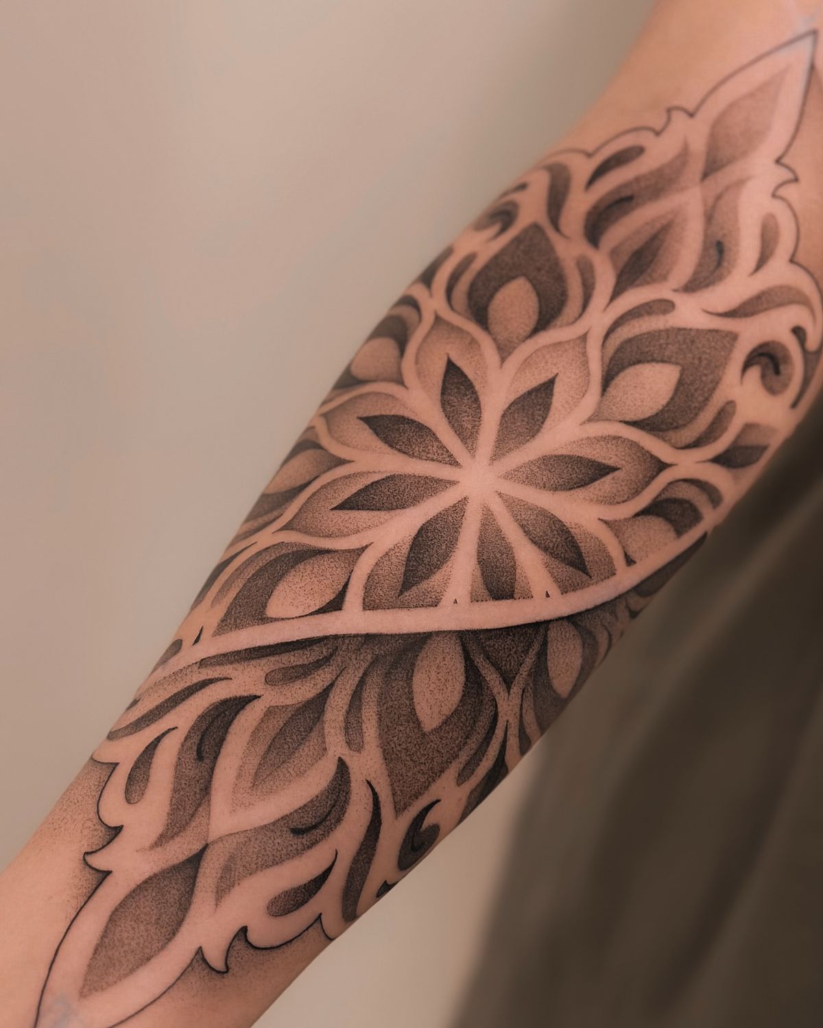
This sleeve section is pure rhythm. The central floral star shape pulls you in first, then the ornamental curves and layered petal forms keep your eye moving all the way down the arm. It has the richness of a mandala-inspired design, but it feels more fluid and less rigid because the tattoo shading softens every section. I love the way the darker fields sit behind the lighter negative-space patterning, because it makes the whole piece feel carved out of shadow. It is decorative, yes, but also strong and deeply elegant. There is no filler here that feels accidental. Every shape contributes to that polished, enveloping mood that makes a sleeve look intentional from edge to edge.
This is ideal for someone who wants bigger statement styles and likes the look of cohesive sleeve designs rather than separate scattered tattoos. Compared with a more delicate Flower or Lotus flower piece, this kind of ornamental work gives you fuller coverage and a much more dramatic payoff, while still feeling refined because the shading stays velvety instead of harsh. It is also a smart reference for practice stencils or a practice sheet if you are mapping out future sleeve ideas, since it shows how Background, pattern, and contrast can work together without visual chaos. The secret is clean spacing, consistent dot shading, and an artist who understands large-scale flow on the body.
What these tattoo shading ideas really show is how much mood lives in the details. A soft cloud of stippling can make a design feel dreamy. A dense black field can make it feel fearless. A few carefully placed gradients can turn a simple Flower, a surreal symbol, or a bold graphic piece into something that feels completely personal. That is why shading matters so much. It is not just decoration. It is the part that gives a tattoo its atmosphere.
If you are planning your next piece, trust the styles that keep pulling you back. Save the ideas that feel like you, pay attention to the kinds of techniques and Background work you respond to most, and choose an artist whose shading feels consistent and intentional. The right tattoo does not just look good on day one. It keeps its magic every time you catch it in the mirror, months and years later.