25 Amor Fati Tattoo Ideas That Turn Life’s Twists Into Meaningful Art

Some tattoos are beautiful simply because they look good, while others stay with you because the words mean something every time you see them. Amor Fati—often translated as “love your fate”—belongs firmly in the second category. It is a reminder to embrace the whole story, including the unexpected turns, difficult chapters, lucky breaks, and changes you never planned. And thankfully, meaningful ink does not have to look overly serious. These Amor Fati tattoo ideas range from delicate fine-line lettering and romantic cursive fonts to bold Gothic typography, flowers, butterflies, hearts, and statement-making designs. Whether you want something quietly tucked near the wrist or a larger arm piece with plenty of personality, there is inspiration here for making this powerful phrase feel completely your own.
1. Sunburst Amor Fati Forearm Tattoo

This elegant design gives Amor Fati a little light of its own. The slim capital letters feel refined rather than overly formal, while the radiating sunburst between the words adds movement and optimism. It is one of those amor fati tattoo ideas that quietly catches your eye without shouting for attention. The meaning feels especially fitting here: accepting every part of life while still choosing to move toward the light. The combination of typography and symbol makes the message feel thoughtful, modern, and wonderfully personal.
The inner arm is a smart placement for this kind of fine line work because the flat space allows the letters and rays to remain easy to read. Ask your artist to keep enough distance between the individual lines so the sunburst can age cleanly. This design would also translate beautifully to the wrist or upper forearm if you prefer something more visible. Simple serif fonts work particularly well when you want the philosophy itself to remain the star rather than turning the tattoo into an overly decorative piece.
2. Handwritten Amor Fati Script Tattoo

There is something wonderfully human about lettering that looks as though it could have been written in a favorite notebook. This two-line Amor Fati design skips perfect calligraphy in favor of rounded, confident strokes, giving the old Stoic phrase an unexpectedly warm personality. Instead of feeling philosophical in a distant, academic way, the message becomes almost conversational: love what comes, live with it, and keep going. Among minimalist ideas, this one has just enough character to feel individual while still remaining simple and easy to understand at a glance.
This style works best when you choose fonts that resemble genuine handwriting rather than an overly polished digital script. A medium line weight gives the tattoo more presence and may help it remain legible as it ages. The arm placement offers enough room for stacking the two words without squeezing the letters together. If your handwriting has sentimental value, you could even ask an artist to develop a stencil inspired by your own script, turning a familiar phrase into something that genuinely feels like yours.
3. Amor Fati Anatomical Heart Tattoo

This design takes the phrase literally in the most beautiful way: love is placed right at the heart of fate. An anatomical heart anchors the composition while the letters curve loosely around it, creating a circular design that feels symbolic without becoming too elaborate. The heart gives Amor Fati a more emotional meaning, suggesting that accepting life is not simply an intellectual exercise but something we learn through experience, disappointment, joy, and change. It is a wonderful choice if plain lettering feels a little too minimal for the story you want to tell.
Because the heart contains delicate interior lines, this tattoo benefits from a placement with enough space for detail, such as the inner forearm or upper arm. Fine line shading keeps the anatomical illustration soft and sophisticated instead of heavy. Ask your artist to test the letter spacing carefully in the stencil so the words remain balanced around the central symbol. The design can suit women or men equally well, and increasing the scale slightly would make the heart details even more striking over time.
4. Classic Serif Amor Fati Tattoo

Sometimes two words are enough. This understated Amor Fati tattoo uses crisp capital lettering and generous spacing, giving the phrase the calm confidence of an inscription carved into stone. There are no unnecessary flourishes, and that restraint makes the message feel even stronger. If you are drawn to Stoic philosophy but want something stylish rather than obviously themed, this is one of the easiest ideas to make your own. Its meaning stays front and center, while the clean typography gives it a timeless quality that should work beautifully with almost any personal style.
A straightforward text design like this depends heavily on proportion and placement, so spend time choosing your exact letter size before the appointment. The inner forearm offers a smooth canvas and lets you see the words whenever you need the reminder. Traditional Roman-inspired fonts complement the historical roots of Amor Fati particularly well. Keep the letters large enough that tiny interior spaces do not blur together with age. For an even softer version, you could reduce the line weight without changing the classic structure.
5. Delicate Cursive Amor Fati Tattoo

This whisper-thin script has the intimacy of a private reminder rather than a statement made for everyone else. The phrase flows vertically along the inner forearm, and the loose handwriting gives it a wonderfully personal feeling. Amor Fati can sound grand when written in bold capitals, but here its meaning becomes softer: accept this day, this chapter, this imperfect life. The graceful lines make the design especially appealing if you love understated tattoos that reveal themselves slowly instead of dominating an entire look.
Very delicate cursive fonts require a tattoo artist who is comfortable working with controlled single-needle or fine-line techniques. The narrow arm placement suits the elongated composition because it allows the words to follow the natural direction of the body. Avoid reducing the design too much; extremely tiny loops can eventually lose definition. If you want something subtle enough to disappear under a sleeve yet visible whenever you turn your wrist, this placement strikes a lovely balance between private and expressive.
6. Marcus Aurelius Amor Fati Portrait Tattoo

If subtle lettering feels too quiet for you, this portrait design brings real drama. A sculptural classical face is broken into separate fragments beneath the words “Amor Fati,” creating the feeling of an ancient statue reconstructed into something contemporary. The visual connection to Stoic philosophy makes the design especially compelling: rather than merely displaying the phrase, it builds an entire mood around endurance, perspective, and accepting what cannot be controlled. It has the confidence of a museum piece translated into body art, and it immediately feels more substantial than a simple quote.
This is a design men and women can both wear beautifully, but it needs room. The forearm, upper arm, calf, or even back would provide enough surface for the facial shading to remain expressive. Strong black-and-gray contrast works well because the fragmented portrait depends on recognizable features and depth. Bring your artist several classical sculpture references and discuss how much realism you want before finalizing the stencil. A larger size will preserve the eyes, beard texture, and shadows far better than trying to compress everything into a tiny space.
7. Butterfly and Amor Fati Tattoo

The butterfly changes the emotional tone of Amor Fati completely. Instead of feeling austere or philosophical, the phrase becomes a story about transformation—accepting every version of yourself, including the seasons that forced you to grow. The airy wings and slim serif lettering create a gentle balance between image and text, making this design feel graceful without becoming overly sweet. As a symbol, the butterfly pairs naturally with the meaning of Amor Fati because both can represent change that cannot be avoided but can still be embraced.
This is an especially versatile design women often gravitate toward, although the composition itself is completely unisex. Fine line work keeps the butterfly transparent and light, while the lettering provides structure. The inner arm gives the wings enough horizontal room, but the design could also work on the ribs, shoulder, hip, or upper back. Ask your artist not to overcrowd the wing sections with tiny details; a little negative space will help the butterfly stay crisp and elegant as the tattoo settles.
8. Distressed Bold Amor Fati Lettering

This version refuses to be delicate, and that is exactly its appeal. The heavily distressed letters make Amor Fati look weathered, almost as though the words have already survived something. That texture fits the philosophy beautifully: life can leave marks, rough edges, and imperfect chapters, yet none of those things have to be erased. Among bolder amor fati tattoo ideas, this design feels raw, grounded, and confident. It is less about decorating the phrase and more about giving it physical weight.
Text this dark needs enough surface area to breathe, so the thigh, upper arm, calf, or broad forearm will work better than the wrist. Because distressed fonts contain irregular gaps and rough edges, your artist should simplify the smallest texture details rather than copying every digital imperfection. Solid black ink creates the strongest effect. This style can also work nicely as part of a larger patchwork collection where the typography is allowed to look deliberately imperfect instead of polished and precise.
9. Gothic Amor Fati Forearm Tattoo

Blackletter typography gives Amor Fati an entirely different personality—dark, romantic, and wonderfully unapologetic. The medieval-inspired shapes make the phrase look almost ceremonial, which suits a message about surrendering to the full force of life. It is a beautiful reminder that meaningful tattoos do not always have to look soft or minimal to feel personal. The bold design carries a little rebellious energy while still remaining rooted in a philosophy that is centuries old.
Gothic fonts need generous spacing because the pointed details and thick strokes can visually merge if the tattoo is made too small. The forearm placement shown here gives each word enough room to remain readable while letting the dramatic letterforms follow the length of the arm. This style works particularly well for anyone already wearing blackwork, traditional, or alternative tattoos. Ask for a printed stencil at several sizes before committing; even an extra half inch can make a noticeable difference in long-term readability.
10. Narrow Serif Amor Fati Tattoo

This slightly quirky serif lettering proves that a simple phrase can still have loads of personality. The tall, narrow letters feel a little antique and a little handmade, giving Amor Fati the character of a treasured inscription rather than a perfect computer font. It works especially well alongside other tattoos because it does not demand all the attention for itself. The meaning remains clear, but the design feels relaxed enough to become part of an evolving collection rather than a stand-alone centerpiece.
For placement near the wrist or lower forearm, keep the letter height large enough that thin crossbars remain visible after healing. This kind of typography is a nice alternative to both delicate font scripts and heavy Roman capitals—it has structure without looking overly formal. If you already have larger artwork on the arm, leave a little breathing room between pieces so the new text does not feel squeezed into leftover space. A skilled artist can subtly adjust the spacing to make the phrase look intentional within your existing layout.
11. Romantic Amor Fati Collarbone Tattoo

This one feels almost like jewelry. Flowing calligraphy follows the collarbone while two tiny hearts turn Amor Fati into something warmer and more romantic. I love the contrast between the serious meaning of the philosophy and the softness of the lettering—it suggests that accepting your fate can be an act of love rather than resignation. The placement also gives the phrase a beautiful intimacy, appearing with certain necklines and disappearing completely with others.
Collarbone script benefits from graceful cursive fonts with enough thickness to stay readable against the natural movement of the chest. Because this area changes shape as the shoulder moves, ask your artist to position the stencil while you are sitting naturally rather than holding an exaggerated pose. The design can extend toward the shoulder for a longer phrase or remain compact near the center. If you like feminine design women’s inspiration without flowers or large illustrations, a tiny heart symbol adds personality while keeping everything sophisticated.
12. Simple Cursive Amor Fati Upper Arm Tattoo

There is an easy confidence to this design that makes it especially wearable. The cursive has enough structure to look intentional but still feels like natural handwriting, giving Amor Fati a personal rather than formal mood. Nothing competes with the words, which makes the message itself feel stronger. If you tend to love tattoos that work with your everyday style rather than becoming the center of every outfit, this kind of clean lettering is an excellent middle ground between micro-script and a bold statement piece.
The upper arm is wonderfully forgiving for text because there is plenty of relatively smooth skin, and the tattoo can be shown or covered whenever you choose. Medium-size Font scripts are often easier to maintain than ultra-tiny writing because the loops and joins have more room. Ask the artist to slightly open narrow letters before tattooing. This is also a good starting point if you may eventually build a larger sleeve; the simple shape leaves plenty of room for future flower, symbol, or geometric elements around it.
13. Lotus Flower Amor Fati Tattoo

A lotus flower gives Amor Fati an especially lovely layer of meaning. The flower is often associated with growth through difficult conditions, so pairing it with a philosophy about loving whatever life brings feels remarkably natural. Here, the phrase sweeps toward the bloom in soft script, almost as if the words themselves are growing into it. The overall design feels hopeful and feminine without becoming overly decorative, making it a beautiful option for someone who wants their tattoo to tell a quiet story of resilience.
The elongated composition works beautifully along the inner forearm, where the stem-like movement of the lettering can follow the arm. Fine-line petals keep the flower light enough that it does not overpower the script. When discussing the design with your artist, make sure the lotus and lettering use similar line weights so they feel like one composition rather than two separate ideas. You could also adapt this concept to the ribs or hip, where a slightly larger flower would create an elegant, flowing silhouette.
14. Tiny Minimalist Amor Fati Script

This tiny version has the charm of a secret written directly onto the skin. The barely-there handwriting makes Amor Fati feel incredibly personal, almost like a note you left for yourself during an important chapter. There is no decorative symbol, no dramatic font, and no need for one—the beauty is in how quietly the message appears. For anyone nervous about committing to a larger tattoo, this is one of those ideas that can feel meaningful without changing your overall look in a major way.
Micro lettering deserves extra care because extremely small characters can become less distinct with time. Choose a tattooer who regularly works with fine line text, and ask to see healed examples, not only fresh tattoos. A forearm placement is practical because the skin is relatively flat and easy to monitor during healing. You may be tempted to shrink the stencil even further, but allowing a little extra space between the words will usually produce a cleaner result. Minimal does not have to mean microscopic.
15. Vertical Fine Line Amor Fati Tattoo

The gentle vertical direction gives this script tattoo a graceful rhythm. Rather than sitting straight across the forearm, Amor Fati follows the natural length of the body, which makes the phrase feel almost like a delicate line of movement. The handwriting is light and unforced, perfect if your personal style leans understated and modern. Its meaning remains deeply philosophical, but the visual effect is soft enough to sit comfortably beside jewelry, rolled sleeves, and even more polished everyday looks.
This placement is especially flattering on the inner arm because a vertical design visually lengthens the area without taking up much width. Fine line font scripts need careful aftercare, so avoid friction from tight cuffs while the tattoo heals and follow your artist’s instructions closely. If you want the phrase to be readable to you rather than to someone facing you, discuss orientation before the stencil goes on. That tiny decision changes the entire personal experience of a text tattoo.
16. Flowing Handwritten Amor Fati Tattoo

This flowing script has a lovely lived-in quality, as though the phrase were signed rather than typeset. The slightly uneven letters make Amor Fati feel intimate and approachable, which is a beautiful contrast to the ancient philosophy behind the words. It is the sort of tattoo you might glance at during a complicated day and immediately remember why you chose it. Nothing about the design feels performative; it simply sits there as a quiet reminder to stop fighting every twist in the story.
A medium fine line script like this offers a nice compromise between ultra-delicate micro tattoos and heavier handwriting. The inner forearm gives the lettering enough room to breathe while remaining easy to cover with long sleeves. If you are choosing between different fonts, print the phrase at actual tattoo size and look at it from several feet away; beautiful lettering on a phone screen can become surprisingly difficult to read on skin. A simple design succeeds when every stroke earns its place.
17. Amor Fati Tattoo with Red Heart Accent

This mixed-style design feels fresh because it does not commit to just one type of lettering. Structured capitals spell out AMOR, flowing script carries Fati underneath, and a tiny red heart brings a playful spark of color into the composition. That little red ink detail also reinforces the meaning rather beautifully: love your fate, quite literally. It is a clever idea for anyone who wants a text tattoo with a touch more personality but does not want to add a large illustration.
Mixing fonts works best when there is a clear hierarchy, and here the capitals provide structure while the cursive adds softness. Ask your artist to test several arrangements before finalizing the stencil, because small shifts in spacing can make the design feel either elegant or crowded. Red ink used as a tiny accent can be striking beside black lettering, though you should discuss pigment choices and your skin history with your artist beforehand. The inner arm offers enough room for the contrast to be appreciated without making the tattoo overly large.
18. Minimal Amor Fati Hip Tattoo

There is something effortlessly chic about placing a simple Amor Fati inscription along the hip. The understated capitals make the design feel almost like a private label—visible with swimwear or cropped pieces, hidden completely whenever you prefer. That balance between intimacy and confidence suits the phrase beautifully. The tattoo carries an important meaning without needing to announce itself, which makes it a particularly appealing option if you want your philosophy close to you rather than constantly on display.
The hip gives straight serif lettering a long, smooth horizontal area, but placement should be planned around how clothing sits on your body. Bring the underwear or swimwear style you wear most often so your artist can position the stencil where you actually want it seen. Simple fonts tend to work better here than highly decorative scripts because they stay crisp against the curve of the body. The design could also move slightly higher toward the ribs if you prefer a more discreet result.
19. Hand-Drawn Amor Fati Upper Arm Tattoo

This design has a charming imperfection that makes it feel personal from the very first glance. The narrow uppercase letters are slightly irregular, creating the effect of handwriting transformed into simple block text rather than a polished digital typeface. Amor Fati suits that honesty beautifully—the philosophy is not about creating a flawless life but learning to embrace the one you actually have. The result feels grounded, unfussy, and full of quiet character.
The upper arm is ideal if you like a tattoo that can disappear beneath a T-shirt yet still have enough room to stay readable. A hand-drawn design also gives you the opportunity to personalize the fonts: your artist can create several versions with different spacing, letter heights, and irregularities before producing the final stencil. Resist the urge to make every line perfectly symmetrical. The slightly imperfect quality is what gives this tattoo its attitude and separates it from standard typed lettering.
20. Elegant Calligraphy Amor Fati Tattoo

This sweeping calligraphy makes Amor Fati feel almost like a signature written with a fountain pen. Long, confident strokes give the phrase movement, while the thin linework keeps the overall effect graceful rather than heavy. It is an especially beautiful interpretation if you want the tattoo to feel expressive and artistic but still centered on the words themselves. The phrase becomes more than a quote here—it looks like a promise you have personally signed, which gives its meaning an intimate and quietly powerful twist.
Large cursive fonts often age more gracefully than extremely tiny script because each loop and crossing has enough space to remain distinct. The long inner forearm placement complements the extended strokes beautifully, although a similar design could also follow the ribs or sit vertically along the back. Ask your artist to adjust any overlapping lines that look too dense in the stencil. With calligraphy, the best results usually come from preserving the fluid character of handwriting while simplifying just enough for the design to work naturally on skin.
21. Vintage Serif Amor Fati Forearm Tattoo

This vintage-inspired Amor Fati design has a wonderfully moody personality. The slightly irregular serif letters feel as though they belong in an old book or handwritten journal, giving the phrase a sense of history without making it feel overly serious. There is something appealing about the way the letters stretch along the forearm, almost like a personal motto written during a moment of clarity. The meaning of Amor Fati becomes especially powerful in this style because the imperfect edges quietly reinforce the idea that life does not need to be polished to be worth loving.
The inner arm is an excellent placement for this kind of lettering because the longer surface allows the words to breathe. If you love antique fonts but want the tattoo to remain readable, ask your artist to simplify extremely fine decorative details in the stencil. A medium line weight will help the letters stay distinct as they age. This design works well for men and women who prefer something with more personality than classic Roman capitals but still want a straightforward text tattoo rather than a larger illustrative piece.
22. Delicate Amor Fati Wrist Script Tattoo

This soft Amor Fati script feels almost weightless on the skin. The gentle handwriting follows the curve near the wrist, making the phrase look more like a personal note than a formal quotation. That intimacy suits the message beautifully: instead of announcing a philosophy to everyone around you, the tattoo becomes a small reminder you can glance at throughout the day. The flowing letters keep the design graceful and relaxed, while the simple composition ensures the meaning remains the focus. It is a lovely choice if you want something meaningful without committing to a larger or more decorative piece.
The wrist is a naturally eye-catching placement, so even a fine line tattoo can make an impact here. Because the skin moves frequently and the lettering is delicate, avoid making the fonts excessively small or tightly connected. Ask your artist to test the stencil with your hand relaxed as well as bent so the phrase sits comfortably with normal movement. A little extra space between letters can improve long-term clarity. This style is also easy to pair with bracelets or a watch without making the area feel crowded.
23. Bold Gothic Amor Fati Tattoo with Owl Detail

This Amor Fati design brings together bold blackletter typography and a tiny owl detail for a result that feels strong, clever, and a little mysterious. The heavy letters give the phrase instant presence, while the owl adds a symbol traditionally associated with wisdom and perception. Together, they make the meaning feel less like passive acceptance and more like conscious understanding—seeing life clearly and choosing to embrace it anyway. It is one of those ideas that works especially well if you enjoy tattoos with an old-world, almost scholarly character.
The forearm gives this design enough space for the dark lettering to stay legible, which is important with ornate Gothic fonts. A design of men’s forearms like this can be scaled slightly larger if you want stronger contrast and better separation between the decorative strokes. Ask your artist to keep the owl simple enough that its eyes and shape remain recognizable over time. Because the black fill is heavier than fine line work, the finished tattoo will naturally command attention, making it a great choice for someone who wants Amor Fati to feel like a statement rather than a whisper.
24. Classic Script Amor Fati Inner Arm Tattoo

This elegant script strikes a beautiful balance between traditional and modern. The curved capitals give Amor Fati a touch of old-fashioned romance, yet the clean spacing keeps the design from feeling overly ornate. It has the polished look of a meaningful inscription you might keep for decades, which suits the philosophy perfectly. The phrase carries a powerful meaning on its own, and the flowing lettering adds just enough personality to make it feel intimate rather than generic. It is sophisticated, readable, and easy to imagine fitting naturally into many different personal styles.
For an inner arm placement like this, medium-size cursive fonts are often easier to maintain than ultra-thin micro-script. The smooth area gives the artist plenty of control over each curve, and the horizontal layout works well with the natural shape of the forearm. If you prefer a slightly more delicate result, reduce the line weight rather than shrinking the entire design. This style also offers flexibility if you later want to add a small flower, heart, or symbol nearby without disturbing the clean look of the original tattoo.
25. Ornamental Calligraphy Amor Fati Tattoo

This ornate calligraphy turns Amor Fati into something almost ceremonial. The dramatic loops and elongated strokes give each word its own personality, creating a design that feels romantic, confident, and beautifully expressive. Instead of looking like a simple quote, the phrase becomes a piece of decorative art in its own right. I especially like how the larger initial letters add movement without overwhelming the meaning. For anyone who finds plain block text a little too restrained, this is a lovely way to embrace the philosophy while still showing off a more artistic personal style.
Decorative font scripts need enough room for their loops and crossovers, so the inner forearm is a practical placement for this design. Before tattooing, ask to see the stencil at several sizes and make sure the narrow spaces inside the letters are not too tight. A slightly larger scale can preserve the elegant details for years. The design would also work beautifully along the ribs or upper arm if you want more privacy. Keep the surrounding area simple; intricate lettering like this already provides plenty of visual interest on its own.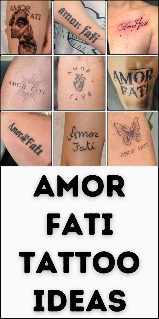
The loveliest thing about Amor Fati is that there is no single “right” way to wear it. Maybe your version is tiny handwriting you can cover with a watch, or maybe it is bold blackletter that makes its presence known from across the room. You might add a flower, butterfly, anatomical heart, or red accent, or simply let two meaningful words stand on their own. Whatever design and placement you choose, give yourself time to find the version that genuinely feels like you. After all, a tattoo about embracing your own path should never feel like someone else’s.