27 Roman Numeral Tattoo Ideas That Turn Meaningful Dates Into Timeless Ink
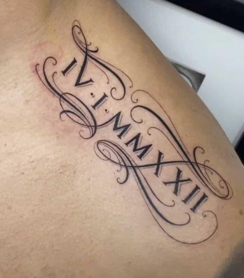
Some dates are simply too important to leave sitting in a calendar. A birthday, wedding day, anniversary, memorial, or private turning point can become something beautifully personal when written in Roman numerals. That is exactly why Roman numeral tattoos never seem to lose their appeal: they feel classic, a little mysterious, and wonderfully easy to make your own.
These 27 Roman numeral tattoo ideas range from beautifully simple forearm dates to florals, butterflies, matching wrist designs, bold lettering, ornamental details, and larger statement pieces. Whether you want something tiny and discreet or a design with enough presence to become the beginning of a sleeve, there is plenty here to inspire a tattoo that feels stylish now and still meaningful years from now.
1. Clean Roman Numeral Forearm Date
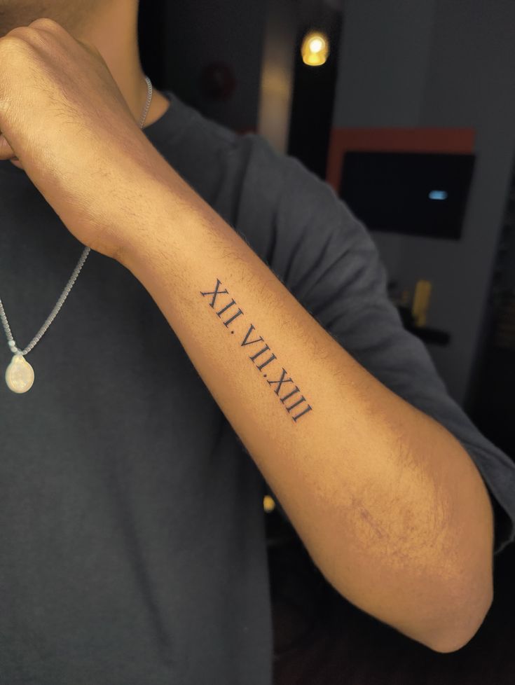
There is something wonderfully confident about a tattoo that does not explain itself to everyone. A simple Roman numeral date running along the forearm feels personal without becoming overly decorative, almost like a private chapter written in a classic code. The slim black lettering has enough presence to be noticed, yet the clean spacing keeps the overall look sophisticated. It is the sort of arm tattoo that can mark a birthday, anniversary, memorial date, or another moment that deserves to stay close without needing an elaborate illustration around it.
This placement works especially well for both women and men who want a design that remains easy to see but still feels understated. On the forearm, medium-sized numerals have room to breathe, which helps the characters remain crisp as the tattoo ages. Ask your artist to create a stencil using the exact date before the appointment so every numeral can be checked carefully. A straight layout like this also works beautifully as a women’s forearm or men’s arm idea because it follows the natural length of the limb rather than fighting against it.
2. Decorative XVII:XVII Numeral Design
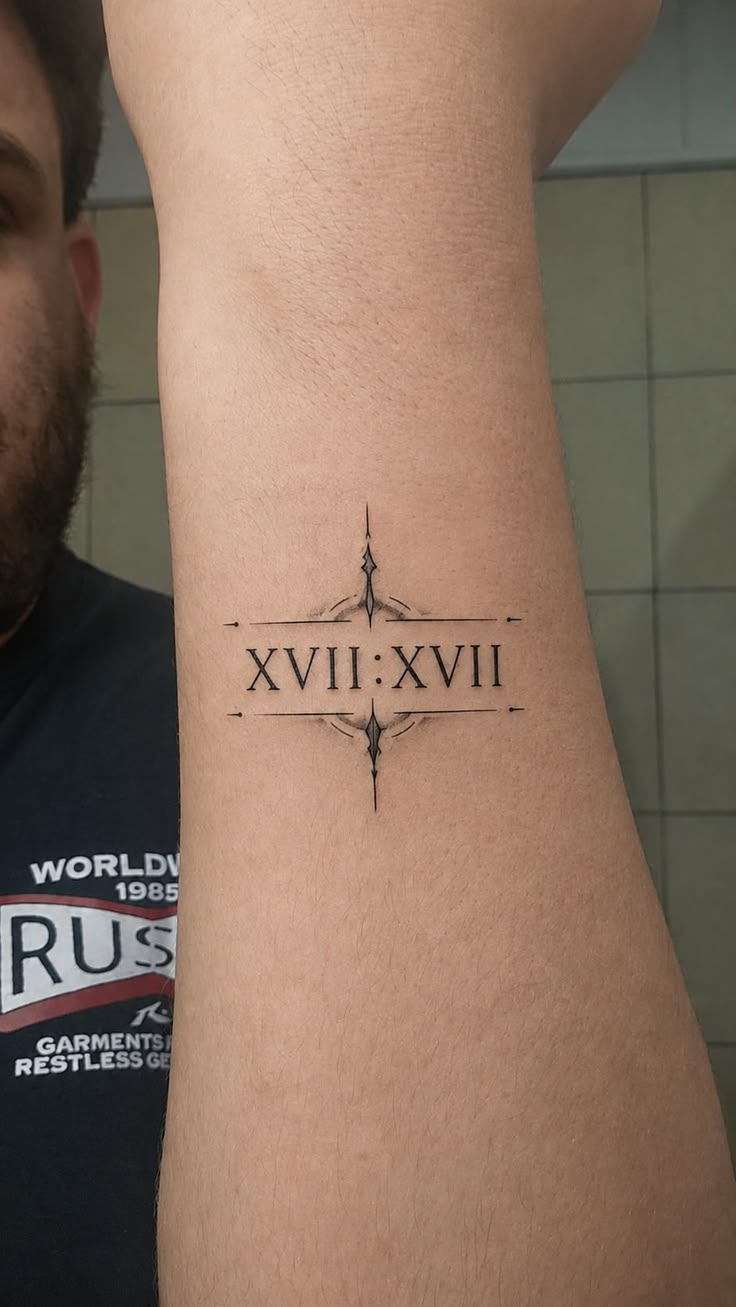
A Roman numeral tattoo can feel surprisingly elegant when a little ornamentation is added around the numbers. Here, the centered XVII:XVII inscription is framed by delicate horizontal lines and pointed decorative details, giving the composition the balance of a tiny vintage emblem. It feels more intentional than a plain date while still keeping the numerals at the heart of the design. I love this approach for anyone who wants something meaningful but also appreciates tattoos that look polished, symmetrical, and almost jewelry-like on the skin.
The inner arm offers enough flat space for these fine designs to stay readable without becoming too large. This is especially flattering for women or men who prefer precise linework rather than heavy shading. Keep the decorative elements slightly separated from the numerals so the tattoo does not blur together over time, and choose an artist who is comfortable with fine-line geometry. If you enjoy classic meanings but want the finished piece to feel more styled, this kind of framed arrangement gives a simple date noticeably more personality.
3. Flowing Roman Numerals with Calligraphy
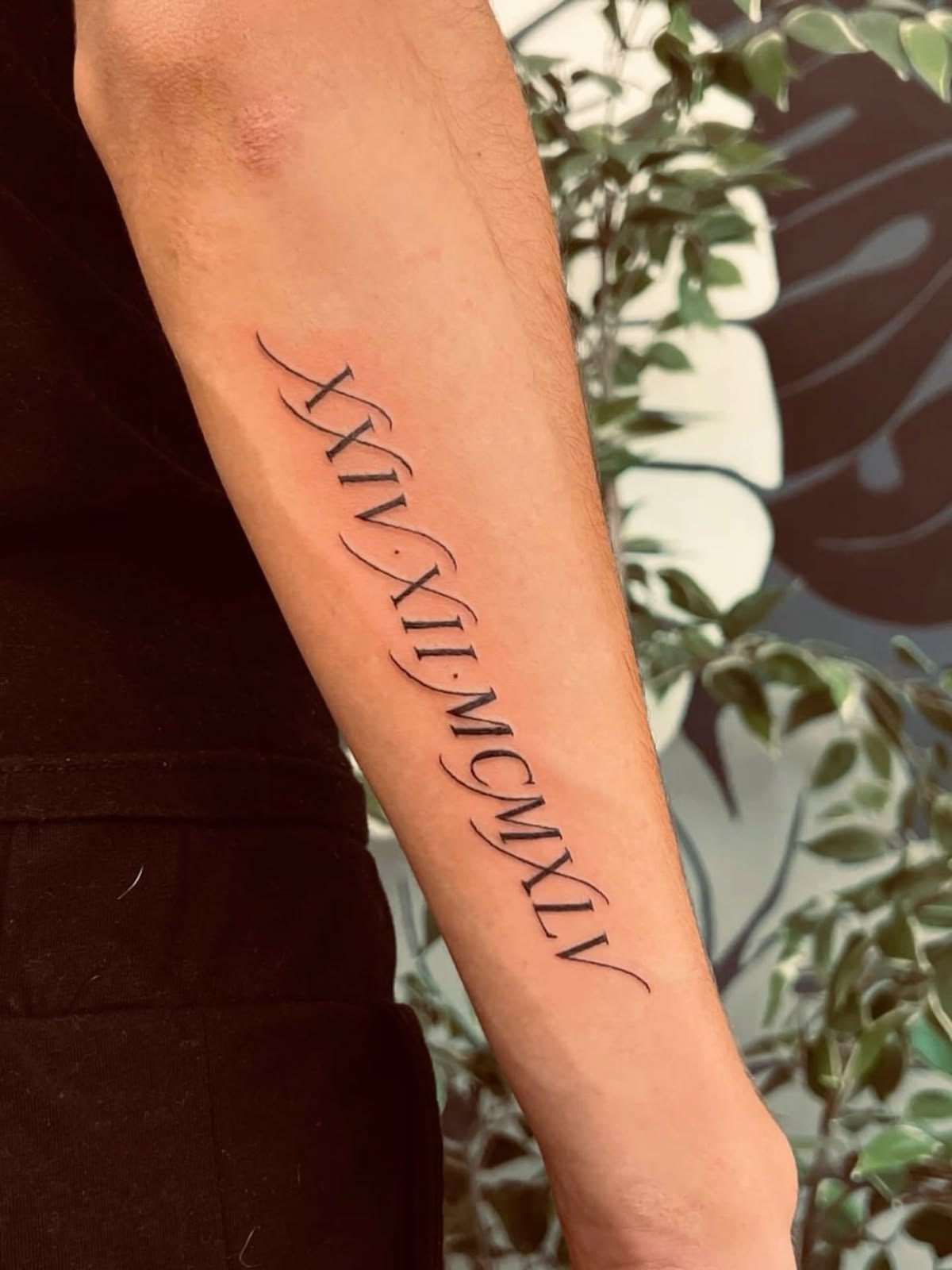
This design proves that Roman numerals do not have to look rigid or formal. The long date is softened by elegant sweeping flourishes that weave around the characters, creating a lovely contrast between structured typography and graceful movement. It feels romantic without becoming sugary, and the extended composition turns a meaningful date into something that resembles custom lettering rather than a standard numerical inscription. For women who love fine details or men who prefer a more artistic interpretation of classic typography, this is a beautiful middle ground.
A longer forearm placement is ideal when the date contains several groups of numerals because the artist can keep each character spacious and legible. The secret is not making the flourishes too thin; extremely delicate loops may disappear faster than the stronger numeral strokes. This approach works nicely on a woman’s arm or along the inner forearm, where the naturally narrow space complements the vertical flow. Keep surrounding tattoos minimal if you want the calligraphic movement to remain the focal point.
4. Vertical Roman Numeral Neck Tattoo
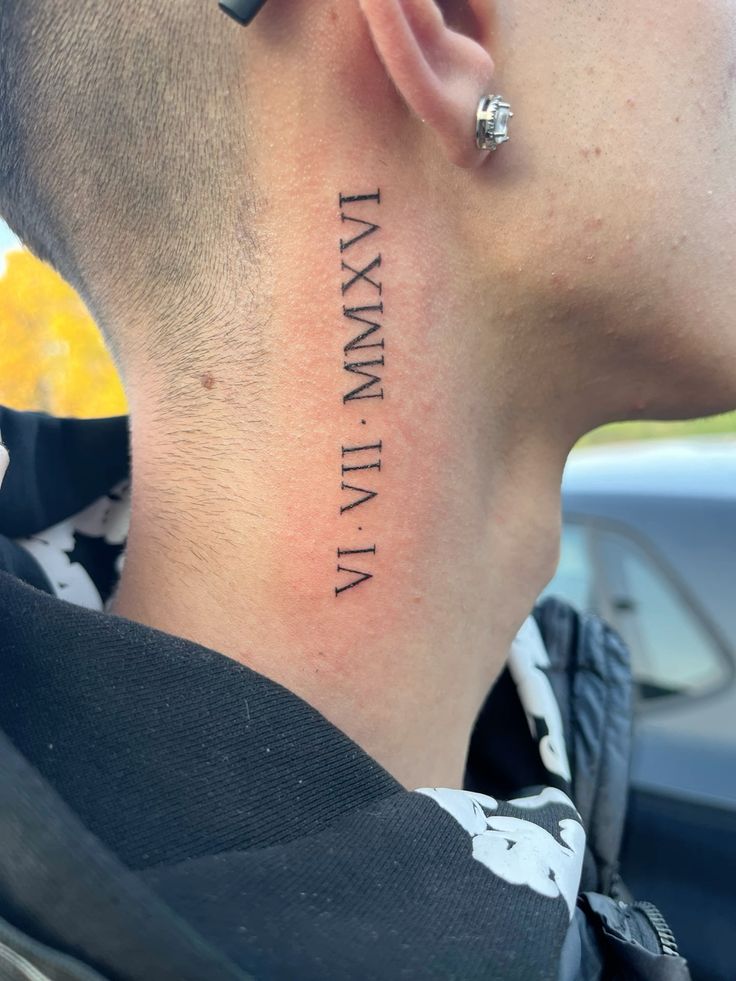
A vertical Roman numeral tattoo on the side of the neck has a completely different attitude from the same date placed on the wrist or forearm. It feels confident, modern, and deliberately visible, yet the traditional serif lettering keeps it from looking overly trendy. Following the natural line beneath the ear gives the design a sleek architectural quality. This is one of those ideas that works because the placement becomes part of the design—the numerals almost appear to travel down the neck rather than simply sit on the skin.
This placement suits someone who is comfortable with a tattoo that cannot always be hidden, so lifestyle and workplace considerations are worth thinking about first. Medium-weight lettering is usually easier to maintain here than ultra-fine lines, particularly because neck skin moves frequently. For men who like minimal designs but want stronger visual impact, the vertical format creates presence without needing a large piece. Keep the spacing generous and double-check every character in the stencil before tattooing, especially when the numerals represent an exact date.
5. Roman Numerals with a Scripture Detail
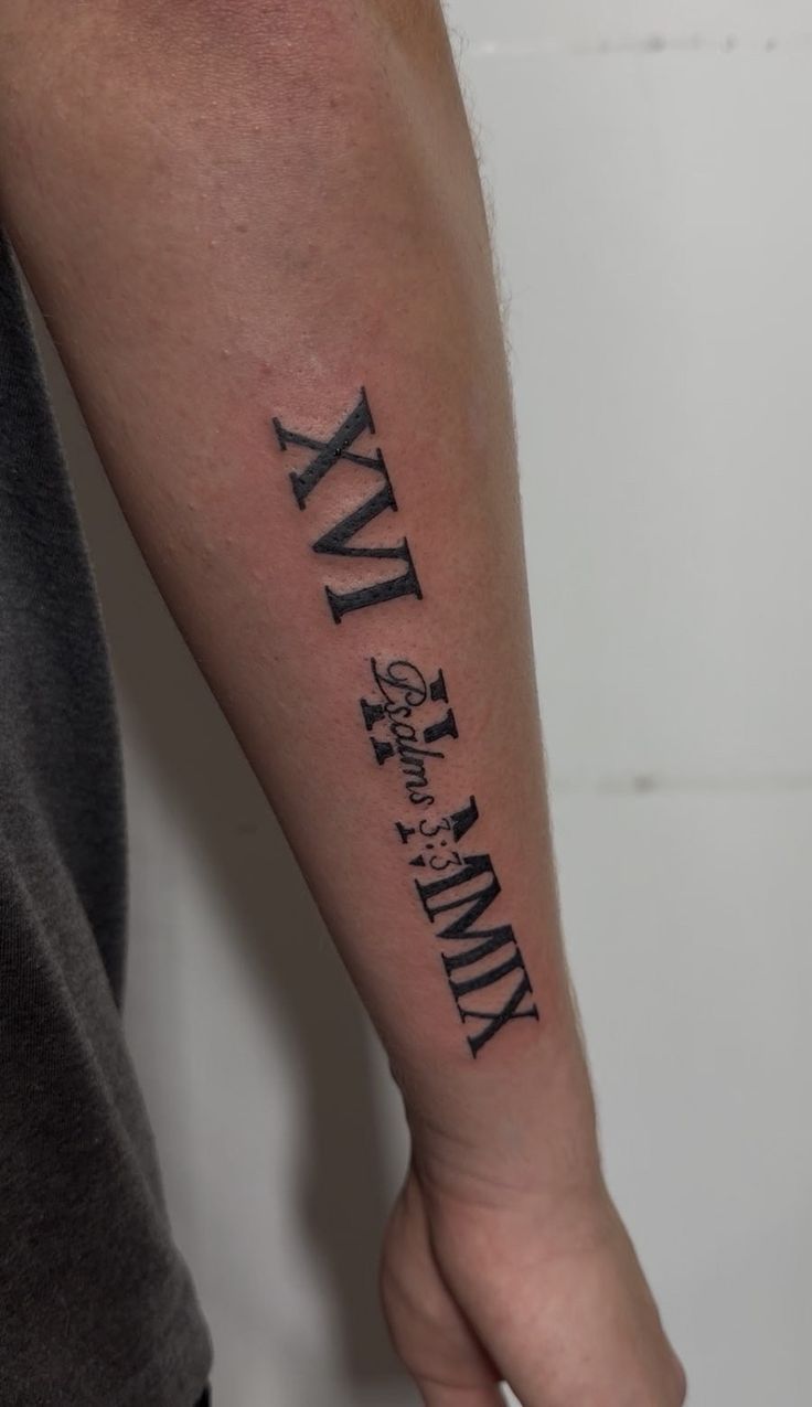
Combining Roman numerals with a small written reference gives the design an extra layer of story. The bold serif characters create the first impression, while the smaller script tucked into the center makes you look twice. That contrast can be especially meaningful when the date and words belong to the same memory, belief, or life-changing moment. Instead of adding more imagery, the tattoo lets typography carry the emotion, which keeps the overall arm design personal and surprisingly refined.
If you like layered designs, ask the artist to establish a clear hierarchy between the large numerals and the smaller lettering. Tiny script needs enough room to heal cleanly, so resisting the temptation to make everything miniature usually produces a better long-term result. A forearm location is practical because there is enough surface area for both elements without crowding them together. It also makes sense for women or men who want their tattoo’s meanings to be visible to them during everyday life rather than placed somewhere rarely seen.
6. Three-Line Roman Numeral Band
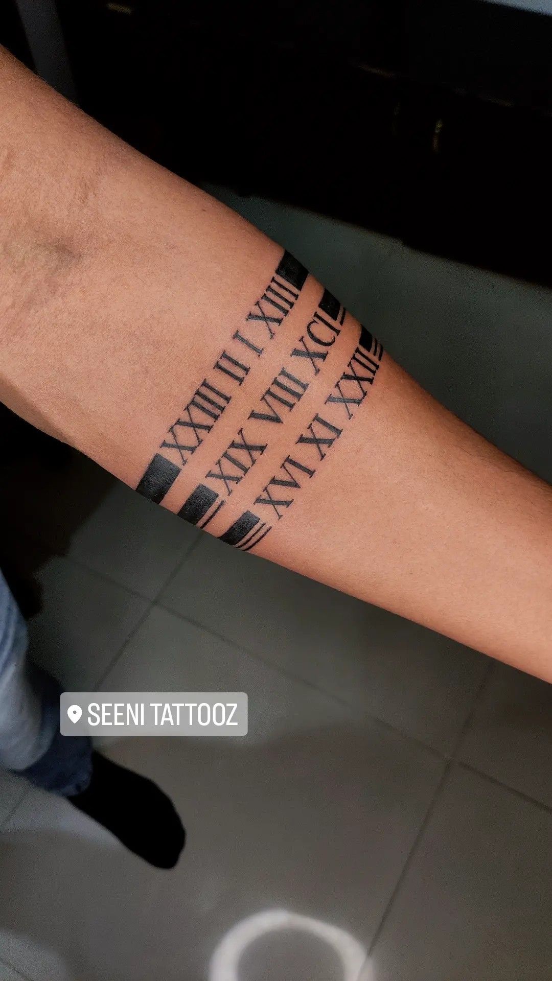
Three rows of Roman numerals paired with solid black blocks create a design that feels graphic, masculine, and almost architectural. Instead of treating each date as a separate little tattoo, the composition brings them together into one organized statement. The repetition gives the arm a band-like effect without forming a conventional armband, and those dark rectangular accents add just enough weight to keep the thin numeral strokes from feeling delicate. It is a smart option when several important dates deserve equal attention.
This type of forearm tattoo benefits from careful measuring because small changes in line spacing are immediately noticeable in a geometric composition. It is particularly effective for men’s arm placement, although the concept can be scaled slightly finer for women who like structured typography. Ask your artist to map every row with a precise stencil before any ink is applied. If additional dates might be added later, mention that beforehand so enough room can be left to extend the pattern without upsetting the original balance.
7. Minimal Roman Numerals Along the Collarbone
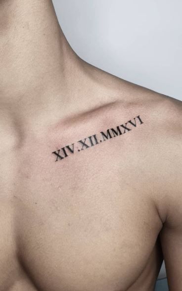
The collarbone has a natural elegance that makes even the simplest Roman numeral tattoo feel beautifully styled. A compact date following the line beneath the clavicle looks clean and intimate, almost like a permanent piece of fine jewelry. There is no need for flowers, shading, or additional symbols when the placement itself creates so much visual interest. I especially like this idea for someone who wants a deeply personal date that can peek out from a tank top or open neckline without dominating the entire look.
For women’s shoulder and collarbone tattoos, scale matters more than decoration. Letters that are too tiny may lose their definition, while overly large numerals can overwhelm the graceful shape of this area. Ask for a medium-fine serif font and position the stencil while standing naturally, since the shoulder can shift slightly when the arm moves. The finished tattoo pairs beautifully with simple necklaces, open-neck tops, or bare shoulders, but it is understated enough to feel polished even without any styling around it.
8. Matching Roman Numeral Wrist Tattoos
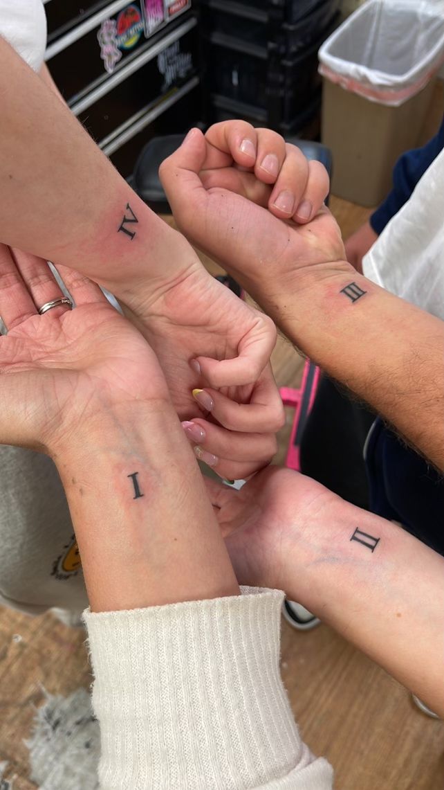
Matching tattoos feel especially sweet when they are this simple. Individual Roman numerals placed on several wrists can represent siblings, best friends, family members, or any group tied together by a shared story. Each person gets a slightly different symbol, but the consistent typography makes the set feel connected. There is something charming about the fact that the full idea only becomes obvious when everyone is together—it turns a tiny tattoo into a quiet reminder of belonging.
Small wrist designs are wonderfully low-fuss, but they still need careful planning. Keep the numeral strokes substantial enough to remain clear after healing, and avoid placing them directly inside the deepest wrist crease where constant movement can affect longevity. These ideas work equally well for women and men because the design is neutral and easy to personalize. A professional stencil is especially useful when several people are getting coordinated tattoos, since it keeps size, font, and orientation consistent from one wrist to the next.
9. Bold Roman Numerals with Red Script
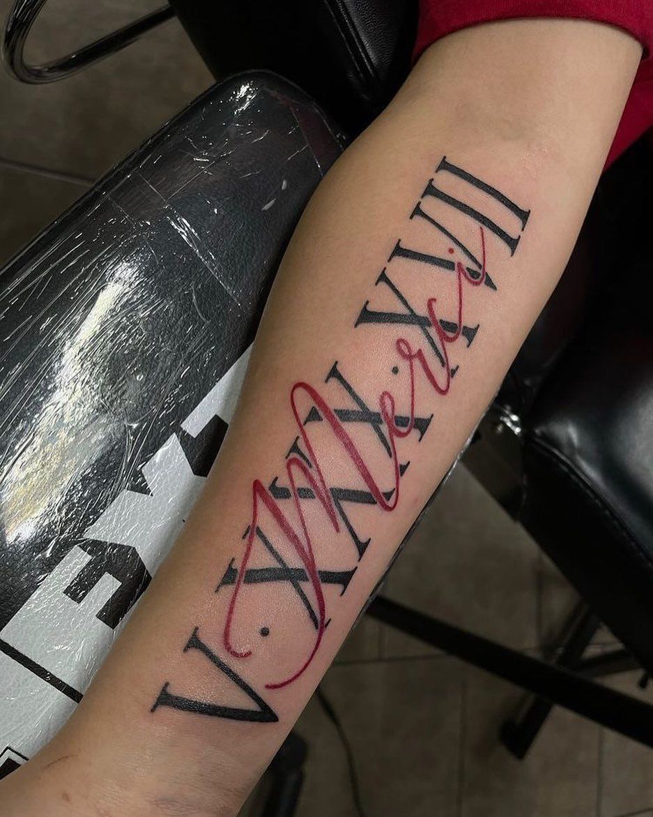
Black Roman numerals already make a strong statement, but weaving red script through them changes the mood completely. The contrast feels expressive and contemporary, with the dark typography providing structure while the flowing red lettering adds movement and emotion. It is almost like combining two different memories or voices in the same tattoo. If plain numeral designs feel a little too restrained for your personality, this approach gives the idea much more individuality without relying on large illustrations.
The forearm is perfect for a layered composition because there is enough room for the two lettering styles to remain distinct. Ask the artist to keep the red script readable against the black forms rather than placing every line directly over the numerals. This kind of arm piece works for women or men who enjoy typography with personality and do not mind a little color. Red pigment may age differently from black, so good sunscreen and consistent aftercare can help preserve the contrast that makes the design special.
10. Roman Numeral Arrow Tattoo
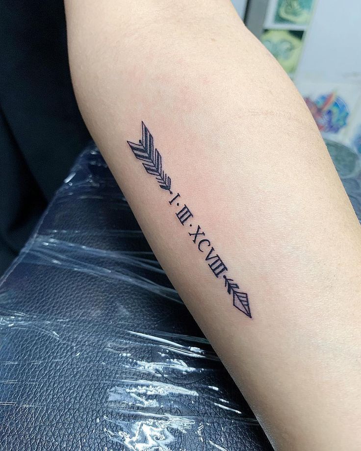
An arrow and Roman numeral date are such a natural pairing because both can suggest direction, movement, and a point in time. Here, the arrow creates a delicate framework while the numerals become part of the shaft, turning the date into something more illustrative without losing its simplicity. It has that lovely balance between symbolic and minimal—enough detail to feel designed, but still light enough that the personal meaning stays front and center.
This works beautifully on a woman’s forearm because the elongated shape follows the arm instead of spreading widely across it. It is also easy to adapt for men by slightly increasing the line weight or overall length. Ask your artist to keep the arrowhead and feather details clear rather than excessively tiny, since those are the areas most likely to soften with age. Compared with a plain numerical inscription, this version feels more decorative while taking up nearly the same amount of space.
11. Infinity and Roman Numeral Wrist Design
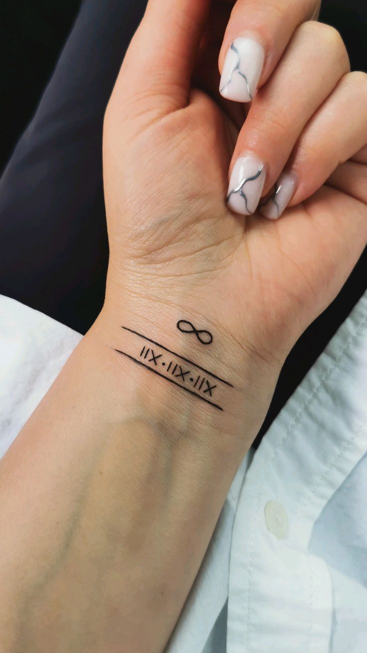
An infinity symbol paired with a Roman numeral date carries an instantly sentimental feeling. The two elements work together naturally: one marks a specific moment, while the other suggests that its emotional importance continues beyond that day. Fine parallel lines frame the numerals and give the tattoo a neat, almost bracelet-like appearance. It is delicate without being overly feminine, which makes this one of those versatile ideas that can be adapted to an anniversary, family bond, friendship, or memorial.
The inner wrist is ideal for a small design you want to see often, but it also receives plenty of sun and movement, so aftercare matters. A slightly stronger line weight can help preserve the thin border lines, while the infinity symbol should have enough negative space inside its loops to stay recognizable. For women who prefer meaningful designs rather than large pieces, this offers a lovely everyday reminder. It can also be placed a little higher on the forearm if you want to reduce wear near the wrist crease.
12. Butterfly, Flowers, and Roman Numeral Date
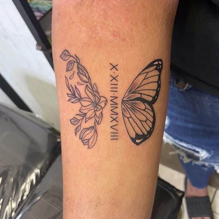
This composition feels like a little story unfolding across the arm. A butterfly and fine floral elements sit on opposite sides of the Roman numeral date, giving the typography a softer and more organic setting. The mix can suggest growth, transformation, remembrance, or simply a love of botanical designs, depending on what the date represents to you. What makes it especially appealing is the balance—there is enough imagery to make the tattoo decorative, but the date still remains easy to notice.
For women’s arm placement, this is a lovely option when a plain numerical tattoo feels too minimal. Fine botanical linework looks best when the artist leaves breathing room between petals, leaves, and the butterfly wing sections. You can also personalize the flowers by choosing blooms connected to a birth month or memory, giving the design extra meanings without adding text. Keep the numerals slightly heavier than the botanical lines so the date remains clear even after the softer details begin to settle with age.
13. Simple Inner-Arm Roman Numeral Date
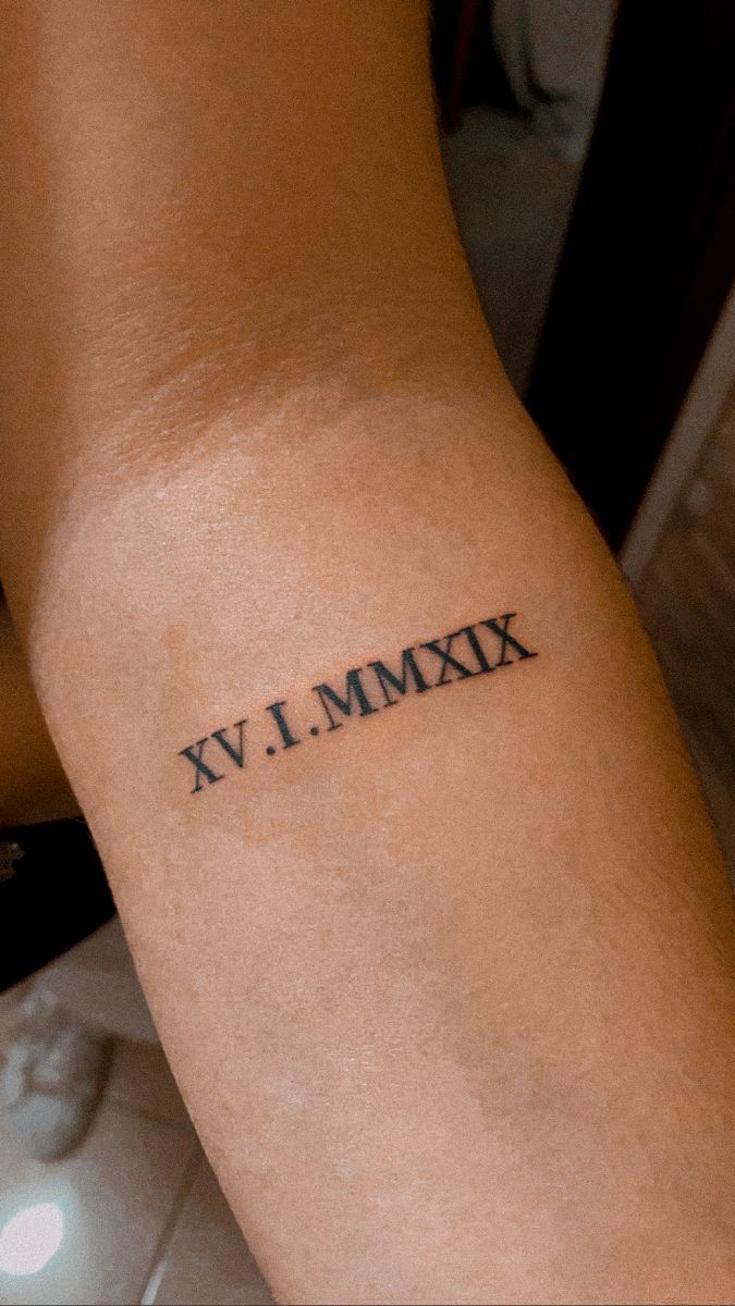
Sometimes the most memorable tattoo is also the simplest. A short Roman numeral date placed neatly along the inner arm has a calm, intimate quality that does not need embellishment. The clean serif font gives it a timeless feel, while the compact size keeps it personal rather than performative. This is the kind of tattoo that can quietly represent one defining day—something you may explain to close friends but never feel obligated to explain to everyone else.
Minimal designs are often easier to live with because they coordinate naturally with other tattoos, jewelry, and clothing. This placement is especially practical for women or men who want something visible when the arm turns but less noticeable from a distance. Leave enough spacing between each numeral and separator so the characters remain distinct. If you might build a larger collection later, a small inner-arm date also leaves plenty of surrounding space for future ideas without forcing you into a full sleeve.
14. Floral Roman Numeral Forearm Piece
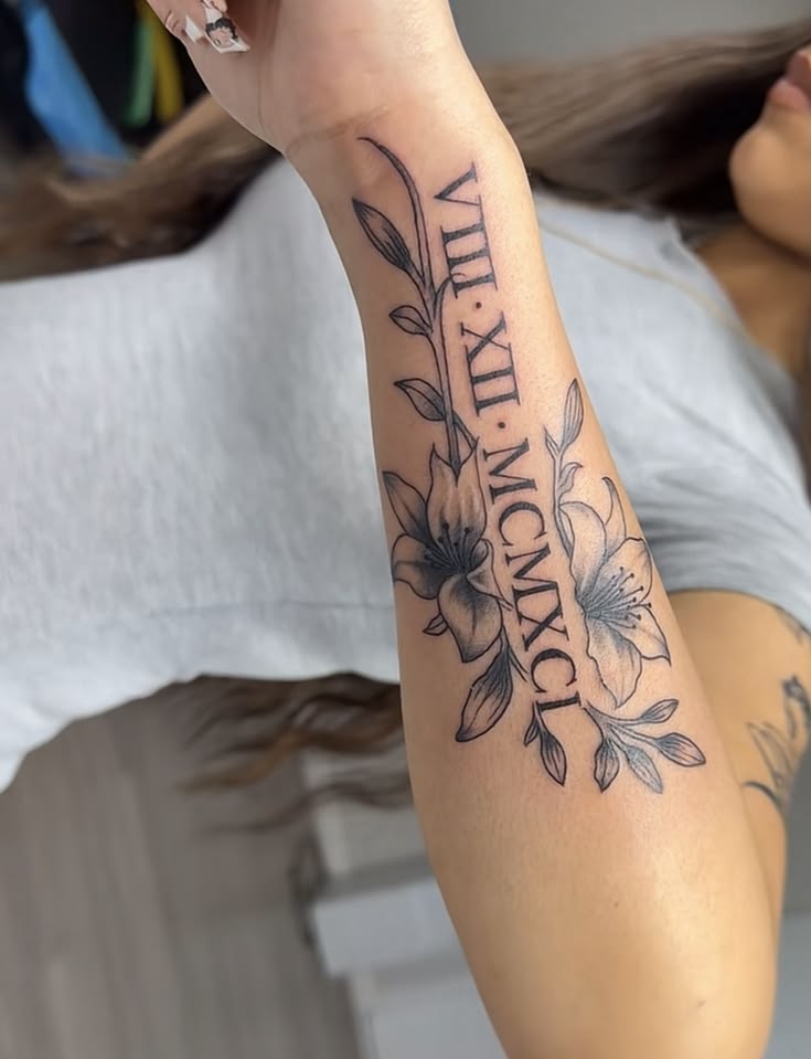
Flowers immediately soften the formal character of Roman numerals, and this forearm design handles that contrast beautifully. The date runs through the center while blossoms and leafy stems curve around it, creating movement without hiding the typography. It feels personal, romantic, and grown-up all at once—not overly delicate, but certainly more expressive than numerals alone. I can imagine this working beautifully for a birth date, wedding date, or memorial where the floral imagery carries its own emotional association.
On a woman’s forearm, elongated flowers help fill the available space without making the tattoo feel bulky. Choose blossoms with distinct shapes rather than packing too many varieties together, and ask for moderate spacing between shaded petals so the composition continues to read clearly over time. This design also works well if you enjoy future expansion: additional leaves, smaller flowers, or another meaningful symbol can be added later. Unlike a large sleeve, it still leaves plenty of uncovered skin and keeps the overall look light.
15. Ornamental Roman Numerals with Fine Flourishes
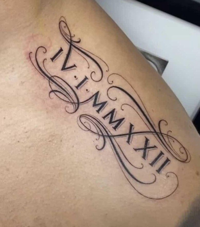
There is a wonderfully vintage quality to Roman numerals surrounded by sweeping ornamental lines. The flourishes frame the date almost like old-fashioned calligraphy on an invitation, turning a simple number sequence into something much more decorative. It feels romantic, dramatic, and slightly formal without requiring flowers or color. If you love tattoos that have a graceful sense of movement, this approach gives the numerals an entirely different personality from the straightforward typewriter-like styles we often see.
The key to ornamental designs is restraint. Too many curls can compete with the date, so ask your artist to keep the numerals as the darkest, clearest element while using finer strokes around them. This style can work on the upper arm, ribs, back, or forearm depending on the amount of detail you want. It is especially flattering for women who enjoy elegant designs with a decorative edge, but the flourishes can easily be simplified for a more neutral look.
16. Shoulder Date with Red Script and Floral Accent
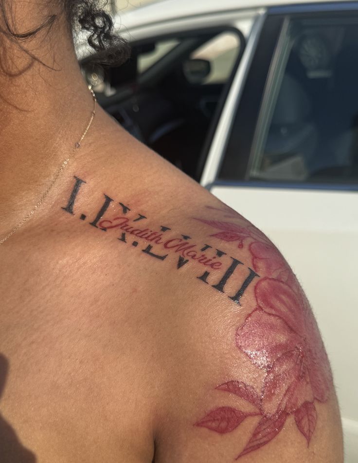
This shoulder tattoo combines several elements without losing its focus. Large black Roman numerals establish the date, red script brings a more intimate handwritten quality, and the floral accent adds softness around the edge of the composition. The effect is bold but still sentimental—almost like combining a permanent calendar entry with a personal note. Color makes the piece feel particularly expressive, and the shoulder placement gives the artist enough space to let every component breathe.
Women’s shoulder designs like this benefit from being planned as one complete composition instead of adding the text and flowers separately. Have the artist position the stencil with your arm both relaxed and slightly raised so the elements sit naturally across the curve of the shoulder. If you choose red flowers or script, remember that colored ink benefits from diligent sun protection. The design can also be extended later toward the upper arm or chest if you eventually want a larger floral arrangement.
17. Roman Numeral Date with Always and Forever Script
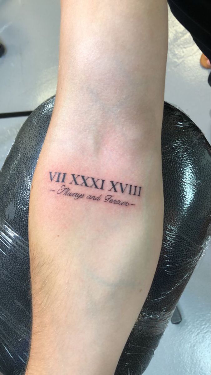
A meaningful date becomes even more emotional when paired with a tiny phrase underneath. The Roman numerals provide the structure, while the delicate handwritten lettering adds tenderness and makes the design feel unmistakably personal. This combination has a lovely memorial or anniversary quality because it connects a specific day with an ongoing feeling. The whole piece remains small and understated, yet it carries more narrative than a date alone.
Because the script is finer than the numerals, choose an artist who regularly works with small lettering and can advise you on a size that will age well. The forearm is one of the safest placements for this balance because the surface is relatively flat and gives each line room to stay separate. This idea works beautifully for women and men who want words included without creating a text-heavy tattoo. Keep the phrase short so the Roman numerals remain the visual anchor rather than competing with a long sentence.
18. Double Roman Numeral Date Layout
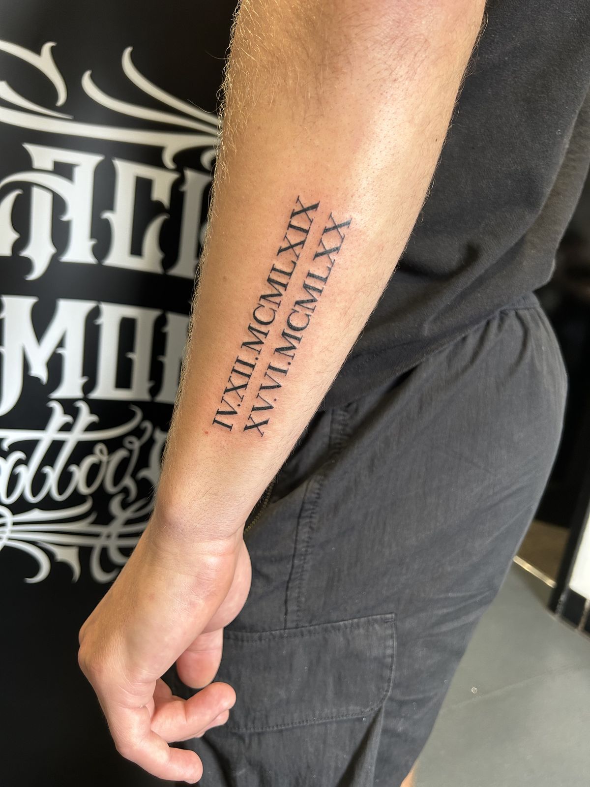
Two Roman numeral dates placed side by side create a striking sense of balance, especially when both carry equal emotional weight. The parallel arrangement feels clean and deliberate, almost like paired entries in a personal timeline. It is a great way to honor two children, two anniversaries, family dates, or separate moments that belong together. Because the typography does all the work, the tattoo looks strong without requiring symbols, flowers, or additional decorative elements.
A forearm offers enough length to keep two rows readable, but precision is essential. Ask the artist to align both dates carefully and use the same baseline, spacing, and letter height throughout. This is particularly effective as a men’s arm design because the elongated format follows the shape of the lower arm, although the same layout can easily be scaled for women. If the dates are long, resist shrinking the type too much; extending the design slightly usually looks cleaner than compressing every numeral into a tight space.
19. Long Vertical Roman Numeral Forearm Tattoo
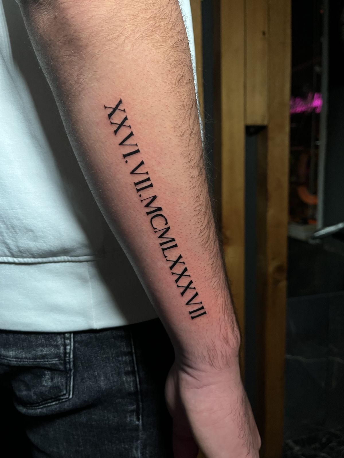
A long Roman numeral date running vertically down the forearm has a wonderful sense of direction. The eye naturally follows the characters from top to bottom, which makes the tattoo feel more dynamic than a conventional horizontal inscription. Bold black lettering keeps the numbers readable, while the slim overall shape prevents the design from becoming too heavy. For men who prefer straightforward tattoos with strong visual structure, this is an especially effective way to turn one important date into a noticeable arm piece.
Placement is everything with a design this long. The stencil should follow the natural center line of the forearm so the numerals do not appear crooked when the arm is relaxed. Medium-weight serif lettering is a practical choice because it remains crisp without requiring excessive width. Compared with a horizontal forearm date, the vertical arrangement feels more graphic and leaves open space on either side for future additions. It can even become the starting point for a larger sleeve if you decide to build around it later.
20. Rose Sleeve with Roman Numeral Banner
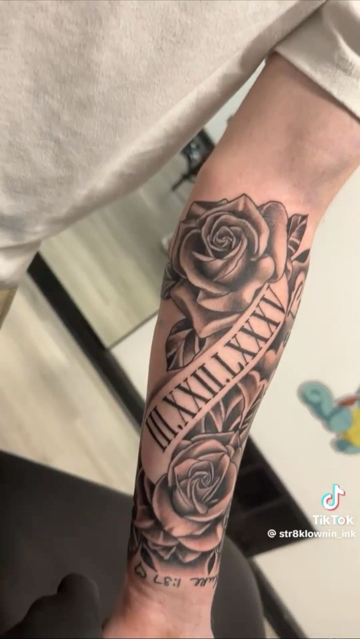
This is the dramatic option for anyone who loves Roman numerals but wants them incorporated into a full illustrative tattoo rather than standing alone. Deeply shaded roses fill the forearm while a lighter banner cuts through the composition, giving the date a clear place to sit. The contrast is beautifully effective: soft petals provide texture and emotion, while the clean numerals bring order to the design. It feels bold, traditional, and personal all at once, with enough detail to make the arm look finished from every angle.
If you are considering a sleeve or substantial forearm piece, plan the numerals before the surrounding roses rather than trying to squeeze a date into leftover space afterward. The light banner creates essential negative space and keeps the characters readable against the darker shading. This approach works particularly well for men who like large designs, though women can soften the composition with finer floral shading or additional leaves. Discuss the entire arm layout with your artist from the start so future extensions connect naturally instead of looking like separate tattoos.
21. Butterfly Roman Numeral Shoulder Tattoo
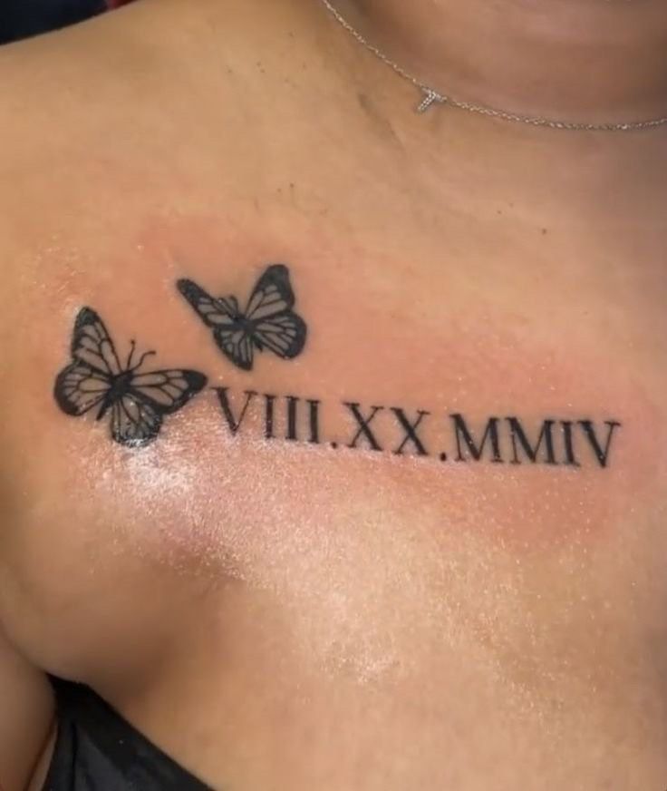
Roman numerals feel instantly softer when they are paired with butterflies. Here, two delicate butterflies hover around the date, turning a simple sequence of numbers into something personal and quietly romantic. There is a lovely sense of movement in the composition, almost as if the memory represented by the date is still alive and changing with you. It is one of those designs that works beautifully for women who want their tattoo to have meaning without becoming overly sentimental or crowded with extra symbols.
The upper chest and shoulder area gives this design enough breathing room while still keeping it easy to reveal or cover depending on the outfit. Women’s shoulder placement works especially well with medium-sized numerals because the lettering can follow the natural line of the collarbone. Keep the butterfly details relatively open rather than packed with tiny lines, and have the artist test the full stencil while you are standing naturally. The result feels lighter than a floral piece while still adding more personality than plain numerals alone.
22. Roman Numeral Chest Tattoo with Rose Accent
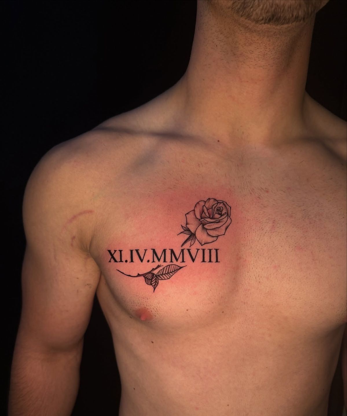
A Roman numeral date across the chest has a confident, grounded look, and the small rose above it adds just enough softness to keep the design from feeling too severe. The combination feels balanced rather than overly decorative: structured black lettering carries the important date, while the rose introduces a personal symbol that could represent love, family, remembrance, or simply a favorite traditional motif. It is an appealing choice for men who like classic tattoos but still want something with a thoughtful emotional layer.
The broad chest gives the numerals room to stay large and readable, so there is no need to squeeze the lettering into an overly compact format. This placement works especially well for men who prefer designs that can remain hidden under everyday clothing but look strong when visible. Ask the artist to center the stencil carefully in relation to the chest rather than simply following the nipple line. A slightly heavier font also suits this area well and gives the tattoo a more traditional character without requiring additional shading.
23. Matching Roman Numeral Wrist Tattoos
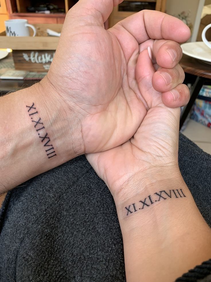
Matching Roman numeral tattoos have a wonderfully intimate quality because the connection is obvious to the people wearing them without needing to be explained to everyone else. Two dates placed on the inner wrists can represent a shared anniversary, family bond, friendship, or another important milestone. The matching serif lettering makes the pair feel coordinated while still allowing each person to carry the tattoo individually. It is simple, meaningful, and refreshingly free of unnecessary decoration.
For couples or family members, consistency matters more than making the tattoos identical in every tiny detail. Have the same artist prepare both stencil designs using the same font, line weight, and spacing, but allow for slight size adjustments so each tattoo fits the wrist naturally. This works equally well for women and men and remains one of the easiest matching ideas to live with. Position the numerals just above the deepest wrist crease to reduce constant friction and help the lettering stay crisp over time.
24. Bold Roman Numeral Inner Arm Tattoo
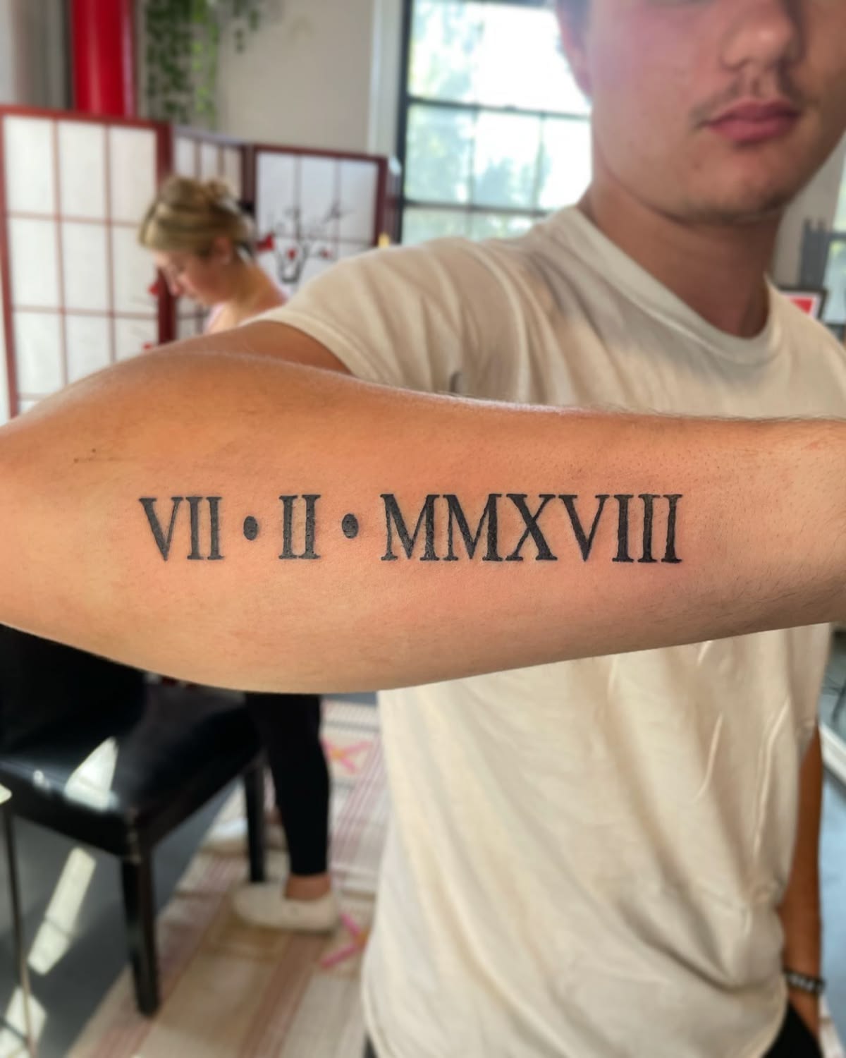
There is something satisfying about Roman numerals done on a larger scale. Instead of whispering, this design makes the date the entire statement, using bold serif characters and simple dot separators to create a strong graphic rhythm along the arm. No flowers, script, or ornamental details are needed because the typography already has plenty of personality. For men who prefer uncomplicated tattoos with a little visual weight, this approach feels classic, confident, and very easy to wear.
The long inner arm is an excellent placement when the date contains several characters because the artist can preserve generous spacing without shrinking the font. Designs of men’s arm styles often benefit from slightly thicker strokes like these, which remain readable from a distance and hold their structure well as the tattoo settles. Before tattooing, check that every numeral is correct and that the stencil follows the arm naturally when it is relaxed. The simplicity also leaves plenty of surrounding room if you eventually decide to expand toward a sleeve.
25. Roman Numerals with Always and Forever Script
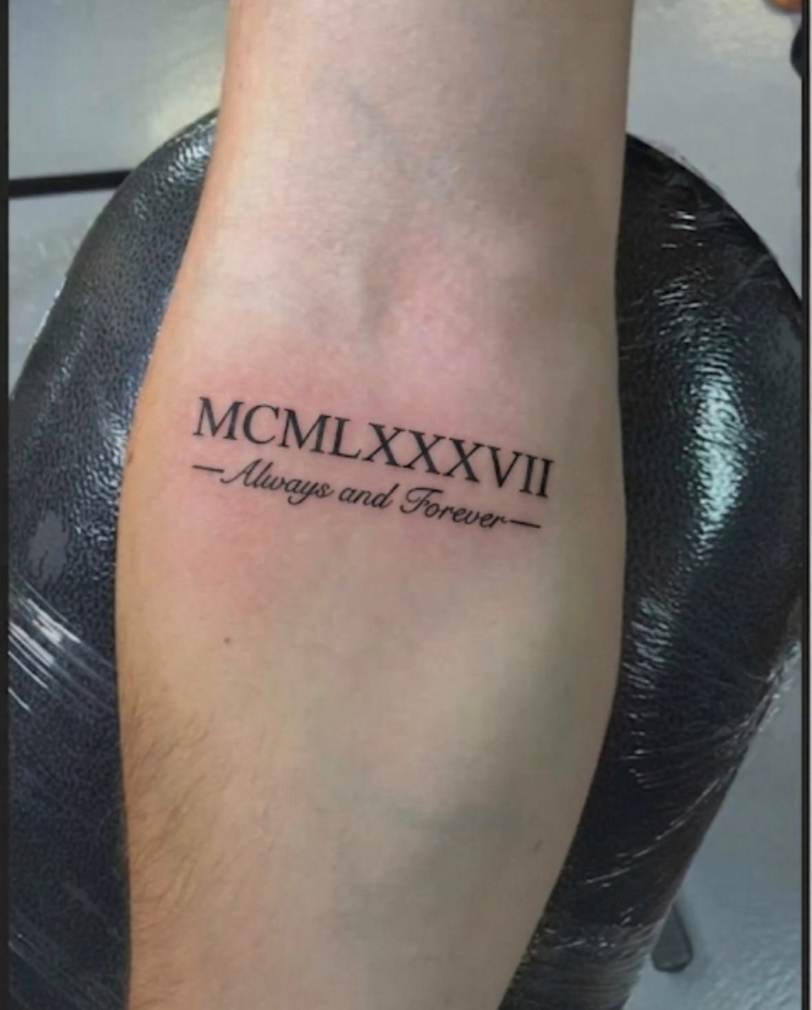
A meaningful date paired with the words “Always” and “Forever” has an unmistakably sentimental charm. The Roman numerals keep the top half of the design clean and structured, while the flowing script underneath introduces a softer, more emotional voice. That contrast makes the tattoo feel like a tiny dedication rather than just a date. It would work beautifully as a memorial, anniversary, or family tribute, especially for someone who wants the meanings to be a little easier to understand without adding a long quotation.
This kind of forearm design works best when the script and numerals are clearly separated so both remain easy to read. Fine cursive can soften over time, so avoid making the words dramatically smaller than the date. Women and men can both adapt the idea simply by changing the font weight or the amount of decorative flourish around the phrase. Compared with plain numeral designs, this version feels more openly emotional while still staying compact enough to fit comfortably on the inner forearm without becoming a large arm piece.
26. Roman Numeral Tattoo with Fine-Line Orchids
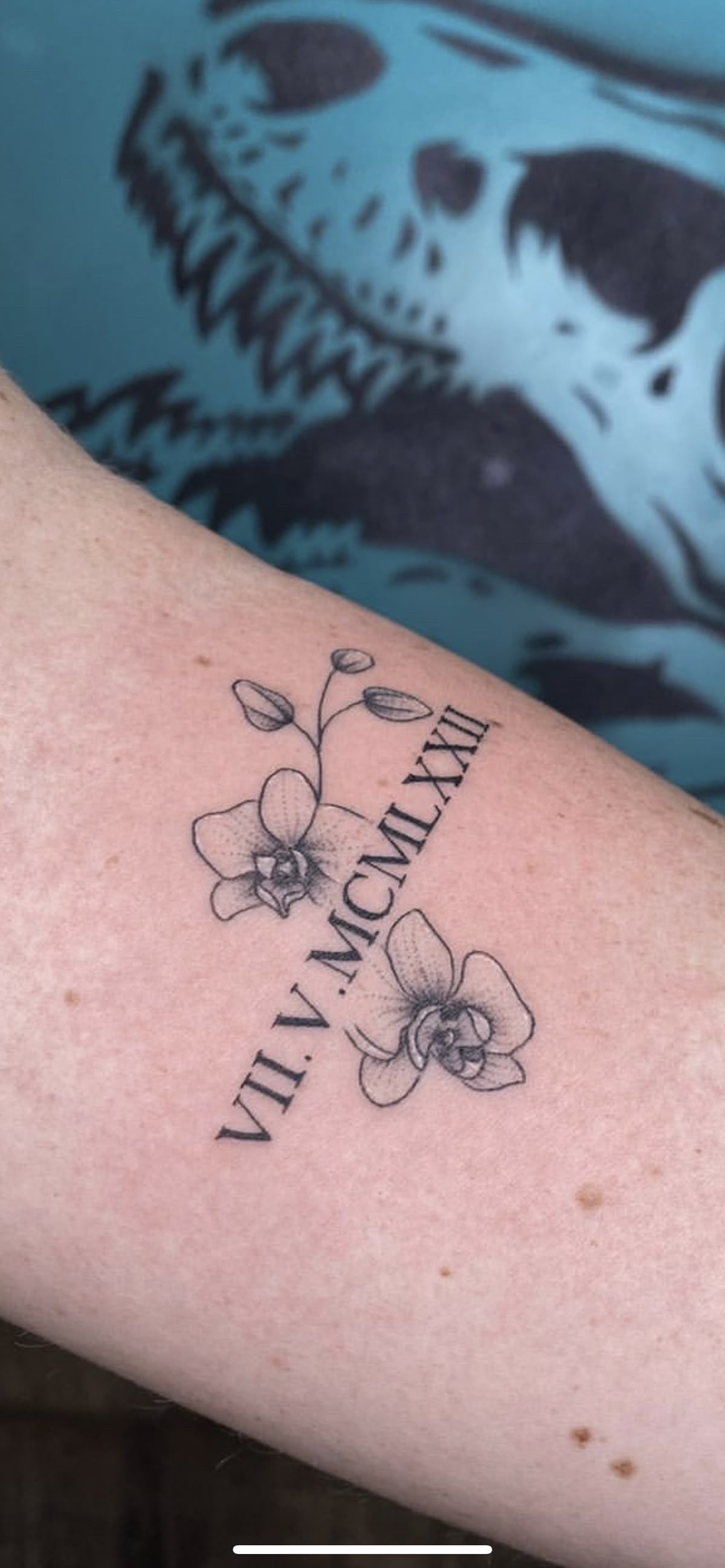
Orchids bring such a graceful, slightly unexpected softness to Roman numerals. The flowers frame the date rather than covering it, so the typography remains the center of the design while the botanical details give the composition movement and personality. The fine petals feel delicate and modern, but the serif numerals keep everything grounded. For women who love floral tattoos but want something less predictable than roses, this is a particularly pretty way to blend a meaningful date with a more distinctive botanical style.
A forearm or upper arm placement gives the flowers enough room to retain their shape, especially if the artist leaves open space between the petals and stems. Women’s arm designs like this look best when the floral linework is slightly finer than the numerals, creating a natural visual hierarchy. Ask for a detailed stencil so you can check how the flowers curve around the date before committing. The design can also grow later by adding another orchid or leafy stem, making it easy to build gradually without jumping straight into a full sleeve.
27. Fine Floral Roman Numeral Forearm Design
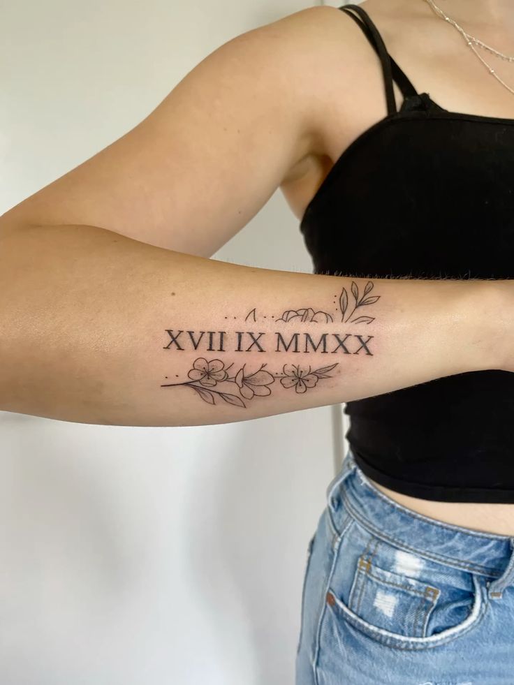
This is a lovely example of how delicate floral details can make Roman numerals feel airy rather than formal. The date sits at the center while fine stems, tiny blossoms, and graceful leaves frame it from above and below. The result feels almost like a pressed-flower illustration wrapped around a private memory. It is especially appealing for women who want something feminine and artistic without using heavy shading or a large amount of ink. The open spacing keeps the design fresh, light, and easy on the eye.
The elongated shape makes this a natural choice for a woman’s forearm placement, where the botanical elements can follow the arm without needing to wrap around it. Fine-line designs require an artist with strong control, particularly around tiny petals and thin stems, so look closely at healed examples before booking. Keeping the numerals a touch darker than the flowers will help the date stay readable as the tattoo ages. It is also a smart option for anyone who wants a decorative tattoo that still feels low-maintenance and easy to pair with future arm designs.
The best Roman numeral tattoo is not necessarily the biggest or most elaborate one. What matters is that the date means something to you and that the design feels natural on your body. Maybe that means three tiny characters on the wrist, a floral forearm piece, matching tattoos with someone you love, or a dramatic rose design that becomes part of a larger sleeve.
Take your time choosing the font, placement, spacing, and any supporting details, and always check the Roman numeral conversion carefully before the needle comes anywhere near your skin. When the date is right and the style feels like you, a simple string of numerals can become one of those tattoos you never get tired of looking at.